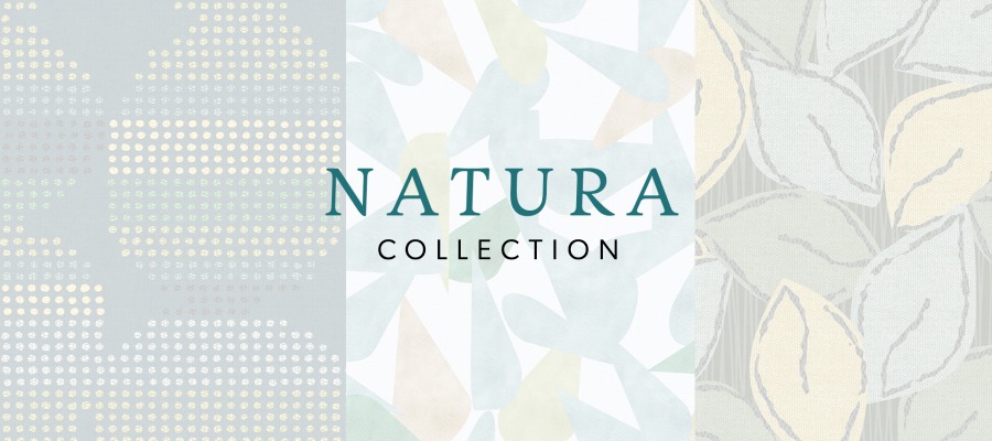
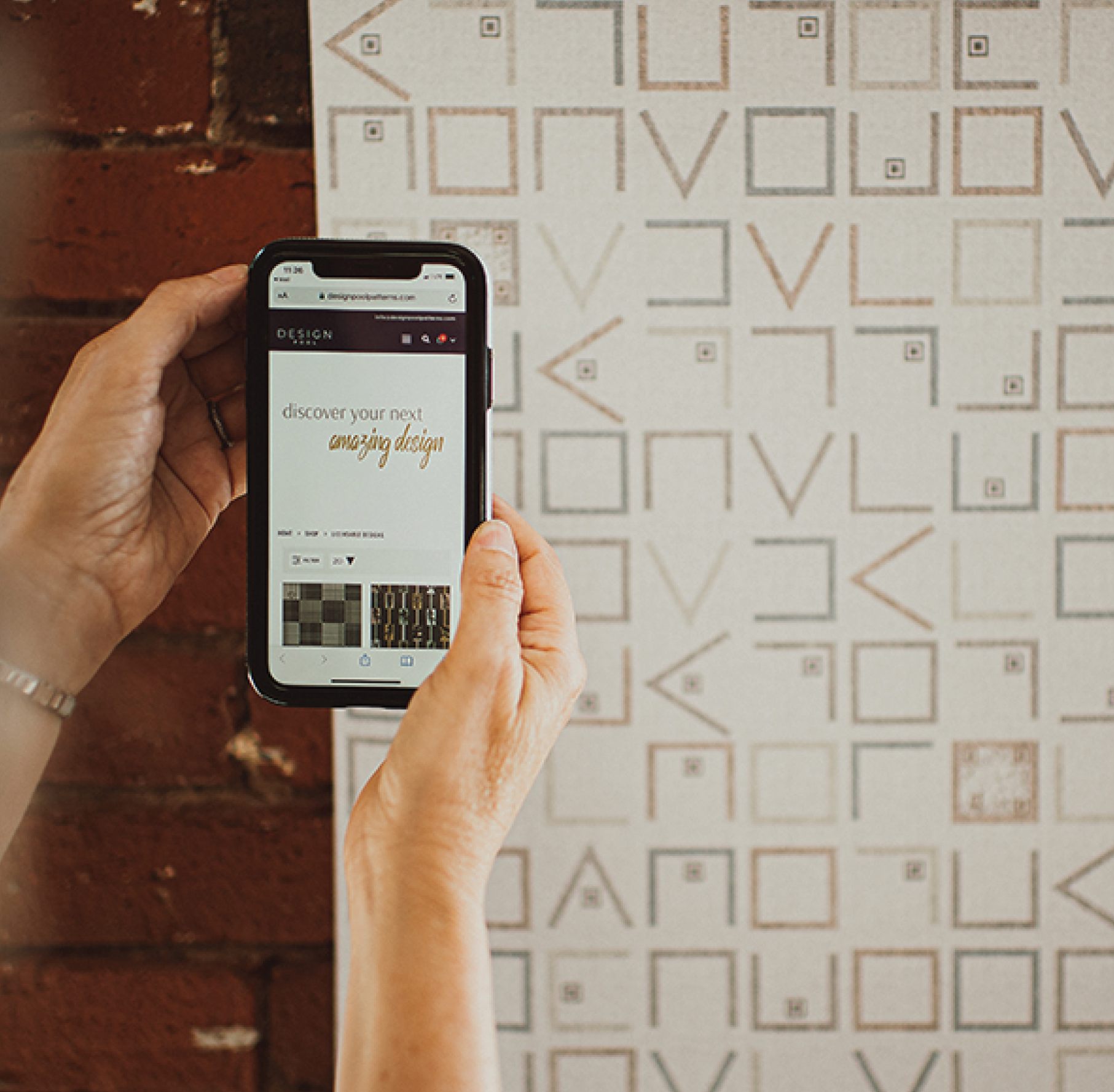
Using Color in Healthcare Environments
As we move through different spaces and environments throughout the day, our experiences are impacted by color choices made by the designers and architects who created that space. How we experience and perceive color can impact everything from our moods to our buying habits and even our healthcare outcomes. As healthcare facilities rethink the way their spaces feel and function, architects and interior designers are consciously making decisions to have a positive outcome on a patient’s experience. Whether on customized glass panels or whiteboards, color plays a big role in that design process. Considering color science when choosing colors in healthcare environments can make a dramatic impact on a space.
Enjoy these tips on effectively using color in healthcare environments:
- The temperature of a color can make a person feel physically warmer or cooler by up to 5ºF.
- Color influences people’s perceptions of time. For example, warmer spaces seem to slow down time and cooler spaces seem to make it go more quickly.
- Our brains work better in spaces with color.
- Certain colors can have positive effects on people. For example, green improves creativity, red is energizing, and pink inspires optimism. Therefore, putting intentional colors in treatment rooms can help aid the healing process.
- When trying to check the health of a person’s skin tone, looking at them on a gray wall is the best option.
- Colors appear less saturated and tend to have a yellow cast as our eyes age.
- Studies have shown that people with depression describe a visually grayed-out world.
- As humans, we feel natural in spaces with darker floors and lighter ceilings because it mimics the natural environment. Dark floors can help someone feel less stressed and more grounded. People in poor health often find the opposite to be disorienting and even cause nausea.
- Wayfinding systems should have a maximum of 4 basic color zones. The more basic the colors, the easier to understand by a wide population of diverse people and cultures. In addition, people are instinctively drawn to warmer colors. If you want people to move toward a certain wall, paint that wall a warmer color.
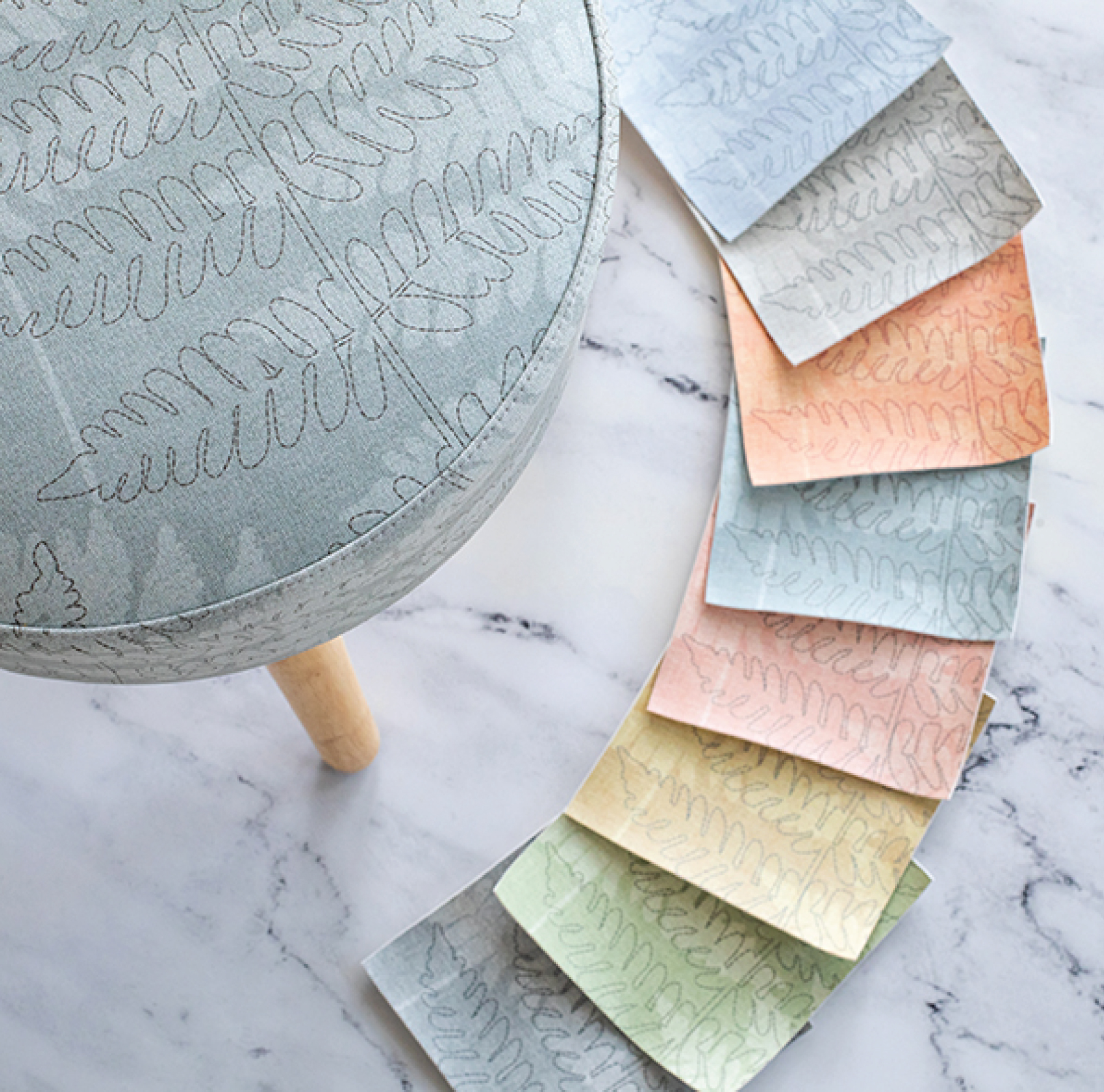
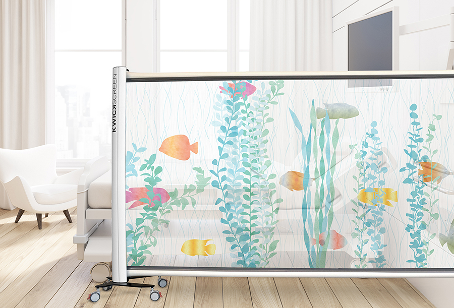
- Patterns that reflect nature reduce stress levels. This does not need to be literal to be successful. For example, a wood grain pattern reminds a person of the outdoors and that is calming. Also, monochromatic colors in a pattern are more calming than high contrast combinations.
How do you use color?
Whether you design buildings, spaces, products, or textiles, color is a powerful tool. Color theory is also an endlessly fascinating subject. Do you notice how color affects your behavior or moods? How do you use color to achieve an end result in your work?
Can’t get enough color info? Check out these other fun facts about color!
Sources: Presentation by Sally Augustin of Design with Science
Share this post
Author
DESIGN/COLOR TRENDS AND AWESOME INFORMATION IN YOUR INBOX
Sign up for our monthly trend letter