
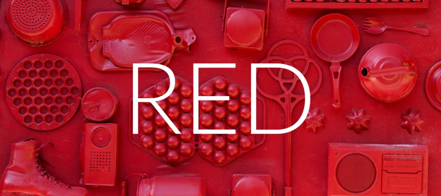
The Power of Red
The month of February is filled with red. February highlights holidays like Valentine’s (and Galentine’s) Day as well as American Heart Month, which focuses on the ways Americans can prioritize heart health. Red is an emotionally intense color with varied and complex meanings. It draws the eye and calls attention to itself. For interior designers, this can be both an asset or a challenge. In order to harness the power of red in your designs, let’s learn a bit more about the color.
Symbolism and Meanings of Red
As a color that demands attention, red is often associated with passion, power, and a call to action. It is highly energetic and draws the viewer’s eye in a dramatic way. Red is often associated with love. Unlike its cousin, pink, red symbolizes a more intense and lust-filled romance filled with passion. Red and its connections to love can also have a negative connotation, with deeper shades sometimes representing jealousy and anger.
Beyond its association with love, the color red has many positive draws. It is seen as a confident color, filled with excitement, vibrance, and power. However, red also is a color used for caution, such as a stop sign. Red can denote something dangerous and aggressive, making it a color that can quickly shift from a positive feeling to a negative one.
Beyond the physical effects, red has symbolic meaning throughout many cultures and religions worldwide. In the Christian faith, it is often associated with the Blood of Jesus Christ, appearing in textiles and art dating back centuries. As far back as the Paleolithic period, red clay was used to protect the dead as they traveled into the afterlife, protecting the body from any evil spirits it may encounter on the way. Red also has roots in the celebration of Chinese New Year, believed to bring good luck, fortune, and prosperity into the New Year.
Fun Facts about Red
More so than most other colors, red has many physical effects on the body. It is known to increase hunger and appetite and is commonly used in marketing by food brands and restaurants. Since red also draws our attention, it is often used by companies to draw customers in, encouraging them to make purchases (think about the red letters read “SALE”, they never fail to allure us). Red also has a long wavelength, making it appear closer than it is, which causes our eyes to draw toward it. This is also why it is one of the first colors humans perceive after black and white.
Harnessing the Power of Red
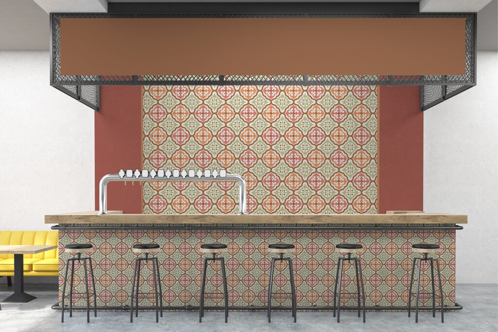
Red is a popular color when it comes to commercial interiors. It is often used in restaurants because of its power to stimulate appetite. However, the shade of red used is important. Bright shades will elevate the heart rate and quickly increase hunger. This shade is better for fast food and fast casual environments with high traffic flow. However, it is not ideal for a sit-down experience where warmer shades work better. This will still boost the customer’s appetite while also creating an atmosphere that feels welcoming and more like fine dining.
Other spaces where you will often see red are high-energy spaces and environments that encourage product purchasing, such as retail stores. Also, spaces for children, such as the kids section of a store or common play areas. On the flip side, spaces where you might not find red are ones that aim to create a calm and relaxing environment, such as spas, hotels, office spaces, and healthcare facilities.
How do you harness the power of red in your interior spaces? We’d love to see examples! Tag us on Instagram so we can check out your use of red.
Share this post
Author
DESIGN/COLOR TRENDS AND AWESOME INFORMATION IN YOUR INBOX
Sign up for our monthly trend letter