
Understanding Color Theory & Using It Wisely
Whether or not we realize it as we move through our day, color is affecting our mood, our decisions, and maybe even our hunger level. People are drawn to that sweater on the rack, or the couch on the showroom floor because of its color. It is what catches the eye first and either draws people in or not. If that color is pleasing and harmonious, it can have a big impact on an impression of a product, and ultimately the sale of one. All this is thanks to color theory.

How the human eye and brain perceive color has been the subject of study and fascination for hundreds of years. We may not think much about the science of how light interacts with the rods and cones in our eyes, but designers and artists are definitely thinking about it, and using this science purposefully to create beautiful items for our lives and homes. Curious about how color theory works? Let’s start with a quick explanation of the basics.
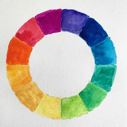
First up, color theory starts with the color wheel.
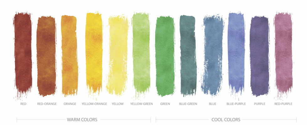
The standard color wheel arranges twelve colors in a circle and shows the relationships between these colors. All colors are categorized into three categories: Primary, Secondary, and Tertiary.
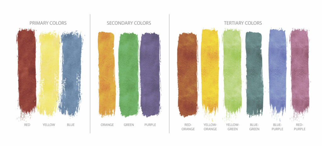
Primary Colors: Red, Yellow, and Blue
Primary colors are the basis of the color wheel and can not be created by mixing any other colors together. Instead, primary colors mix to create the rest of the hues in the color wheel.
Secondary Colors: Green, Orange, and Purple
Primary colors mix together to create secondary colors. For example, red and yellow make orange, yellow and blue make green, and red and blue make purple.
Tertiary Colors: Yellow-Orange, Red-Orange, Red-Purple, Blue-Purple, Blue-Green, and Yellow-Green.
Tertiary colors are made by mixing a primary and a secondary together for a shade in between.
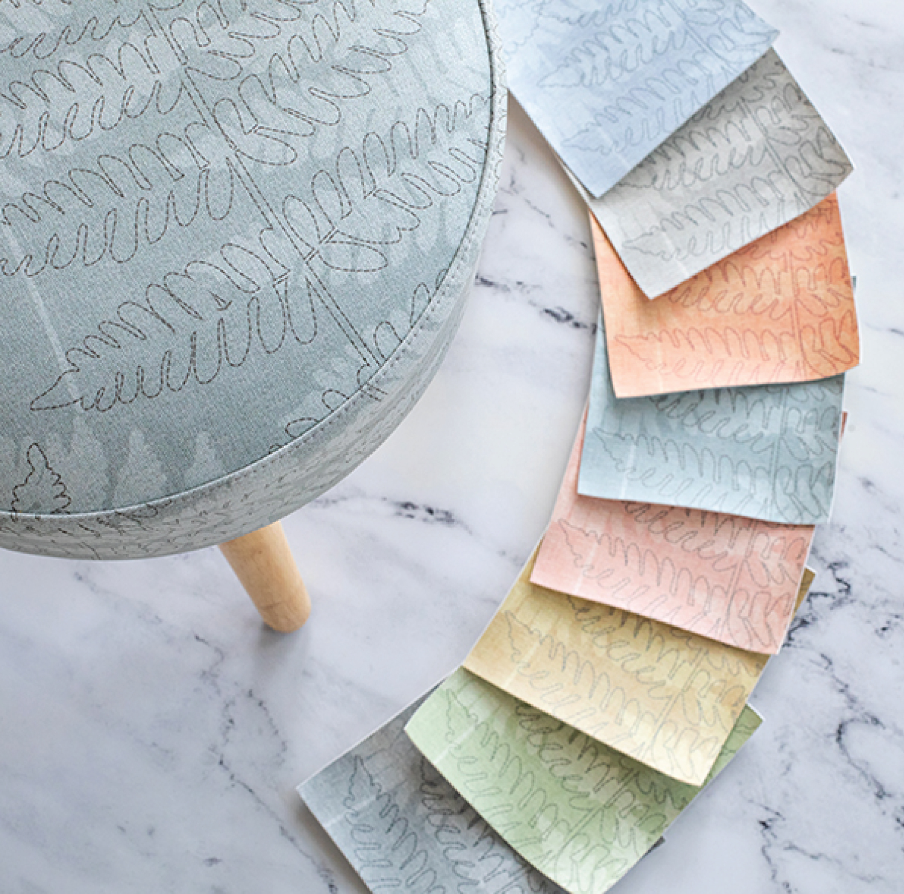
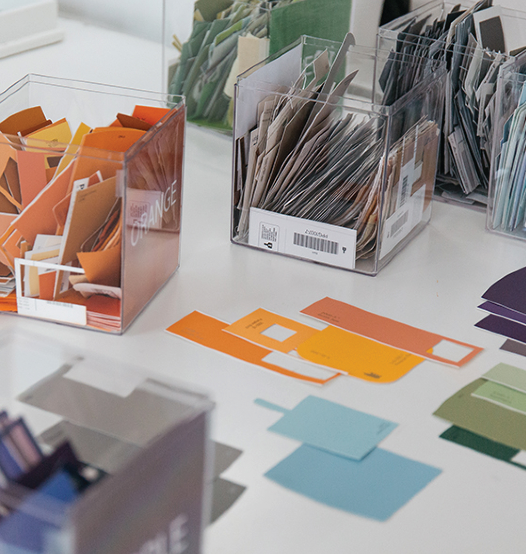
With different combinations of these twelve colors of the color wheel, you can create many shades of colors and can use them together in a creation. At Design Pool, we are constantly thinking about color and color harmony as we design new patterns.
What’s color harmony?
Color harmony refers to how colors from the color wheel are used as tools to create a beautiful end product. Pattern designers use color mindfully to ensure a pattern is harmonious. They want to create a visually pleasing experience for a room, a garment, or however a pattern will be used. Colors that are harmonious enhance each other and become better together than they were on their own. Our brains respond to harmony and also when it is lacking. Our brains perceive a pattern with colors that are not harmonious as unorganized and chaotic, or as boring and bland.
So how do I make my colors harmonious?
Designers have some tools up their sleeves that they use to create a harmonious color palette.
Use analogous colors.
These are colors that are side by side on the color wheel. For example, yellow-green, green, and green-blue.
Use complimentary colors.
These are colors that are opposite each other on the color wheel. These pairs are red & green, orange & blue, yellow & purple. Complimentary colors highlight each other and offer maximum contrast to the eye.
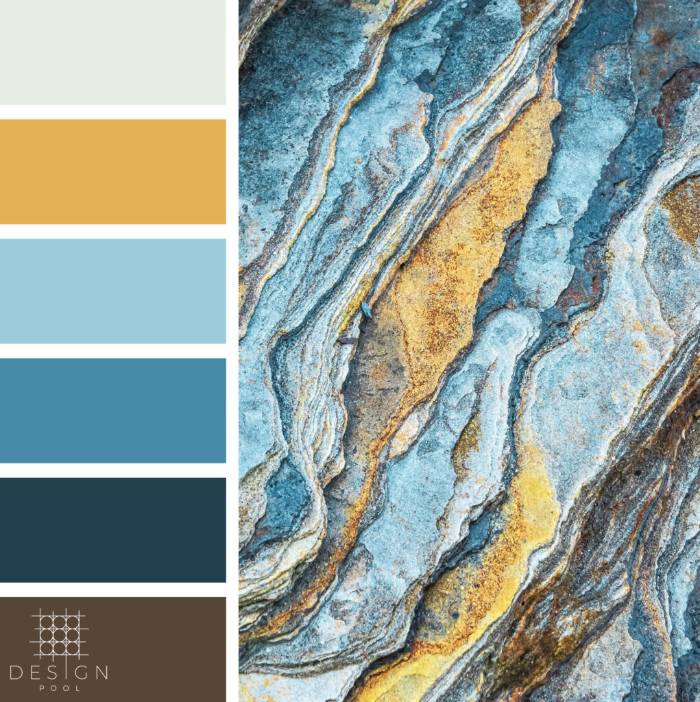
Use colors in nature.
Nature has offered endless inspiration to artists and designers from the beginning of humanity. All one needs to do is walk outside and see how Mother Nature has chosen her color combinations. Stop and pay attention to a beautiful flower up close, wildflowers in a meadow, or seashells at the beach, and you will see different colors working together beautifully.
Are the same colors always harmonious?
Well, not all the time. It’s important to pay close attention to how colors appear in context with other colors. A yellow square looks very different when painted on a blue background, or a pink background. They can also appear different to the eye when used in a small amount or a large amount. It’s not always as simple as reusing the same winning combinations over and over. (To have your mind blown about color context, spend some time looking at the work of Josef Albers.)
Do you have a favorite color combination you return to over and over in your wardrobe, home, or design projects? Show us by tagging us on Instagram! If you’re looking for a particular color, search the Design Pool licensable library by color to see all the patterns available in that hue. And if you don’t see what you’re looking for, contact us to discuss working on a custom color.
Share this post
Author
DESIGN/COLOR TRENDS AND AWESOME INFORMATION IN YOUR INBOX
Sign up for our monthly trend letter