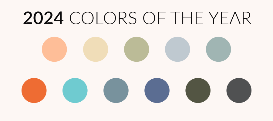
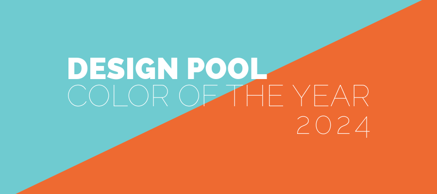
Design Pool’s 2024 Color of the Year Pick
As 2023 winds down, I’ve been looking ahead toward 2024 and looking back on 2023. This year, I chose two colors as Design Pool’s pick for 2024 Color of the Year: Energizing Orange and Balanced Blue. Why two? Initially, I had chosen Energizing Orange because I wanted an energetic color. Yet, I also know that orange is one of those colors people either love or hate. Few people are lukewarm on orange. It is a color that inspires a strong opinion.
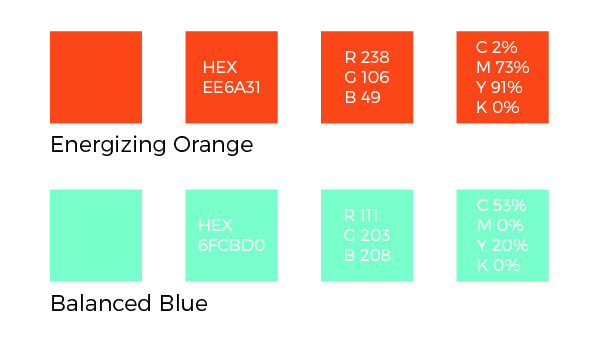
And strong opinions got me thinking about what we have coming up in 2024. Here in the US, we’ll have another election cycle, which tends to amplify a divide and offset our harmony. So, I decided to pair the energy of orange with its complementary color, Balanced Blue. These two colors combine a grounding, earthy hue with a touch of a “sky’s the limit” vibe that I hope inspires an overall sense of harmony.
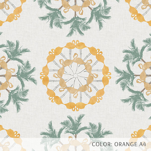
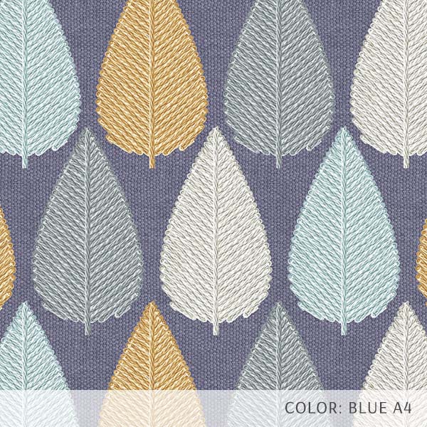
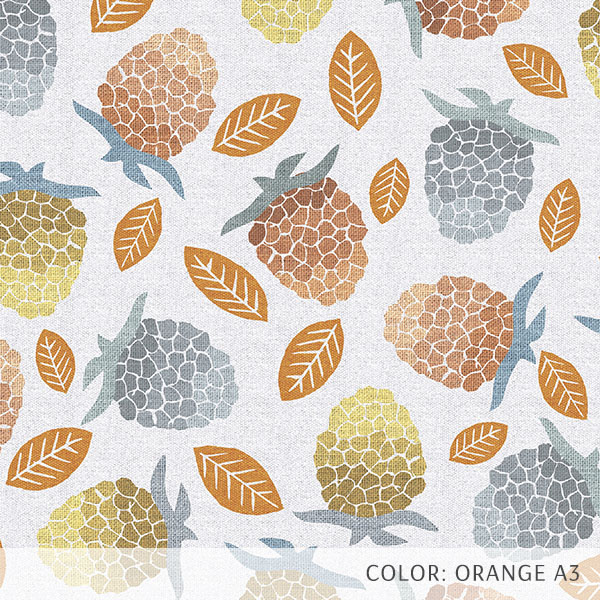
Inspiration for our 2024 Color of the Year pick.
I spent some time researching what was happening in fashion and noted many reds and warm colors throughout the 2023 runway shows. While reds and pinks often get a lot of attention, we often overlook orange because we equate it with Halloween or shag rugs from the 1970s. Yet, fresh modern shades of orange are refreshing, energizing, and warming. A combination of red and yellow, orange takes on the properties and emotions of these two colors.
Verywell Mind writes that the meaning of orange can be very personal. “The way we see orange used in the environment plays a major role in how we feel about it. If you associate the color with pleasant autumn evenings spent with family and friends, then you will likely have strong positive associations with the color.” Yet, other people associate it with superficiality, attention-seeking, or even melancholy.
Utilizing Direct Harmony
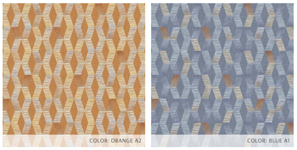
To ground the energy of orange and offset the negative connotations, I utilized color theory’s direct harmony and paired it with its complementary color. According to Hunter Lab, direct harmony means “pairing your key color with the color sitting on the opposite side of the color wheel. Red and green, blue and yellow, and orange and green are the primary examples of direct harmony. Complementary color pairings contrast with one another for a vibrant look.”
Blue is often cited as the most popular favorite color. We are surrounded by blue and have many positive associations with it, such as the sky and the ocean. It evokes a feeling of calmness and relaxation. Even though it can sometimes be associated with sadness, the uplifting orange can keep the energy level positive.
Our pick fits in with the themes of calm and balance that we saw in our annual round-up of 2024 Colors of the Year picks. Here’s wishing all of us a 2024 full of harmony. I hope it is a year that balances out the exciting energy of creativity and attention with a sense of balance and well-being.
Share this post
Author
DESIGN/COLOR TRENDS AND AWESOME INFORMATION IN YOUR INBOX
Sign up for our monthly trend letter