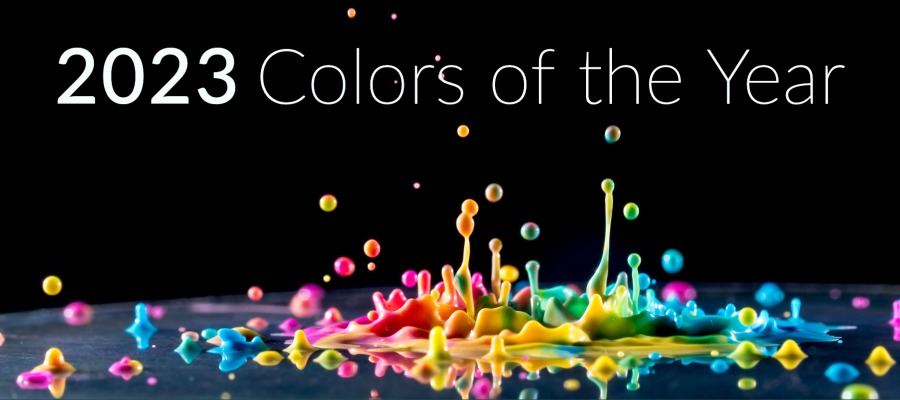
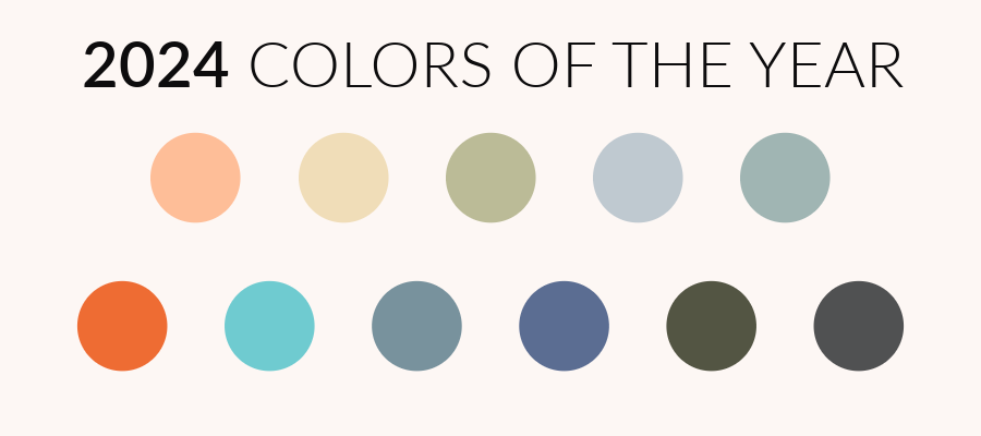
2024 Colors of the Year
It’s that time of year, when we round up all the 2024 Colors of the Year so you have them all in one place. What is always fascinating about rounding up these color choices is seeing what they tell us about this moment in time. The choices Pantone makes, as well as the major paint companies, are a snapshot of where we are right now, as well as where we are heading.

When I look at the colors the major companies chose, the theme that comes up again and again is calm. Nearly every company chose a color that was a peaceful antidote to a busy life. The colors are nearly all grounded in nature, sea, sky, land. They also serve to balance the warm and the cool and inspire a sense of equilibrium.
There is also a sense that these colors serve more as a backdrop for people to highlight their personalities, rather than steal the show as a bold statement.
In the color selections, a lot of the companies spoke about travel. This makes sense. In 2023, people were traveling again. Thanksgiving 2023 was the busiest travel day ever recorded, beating the previous record set in June 2023. After a few years with so much focus inward, people are looking out again and are thirsty for something new. Yet, there is also a lot happening in the world that is stressful and anxiety-inducing. These colors reflect those ideas and give people an inspired place to find peace.
Let’s take a look at each of the 2024 Colors of the Year.

Pantone: Peach Fuzz
2024 marks the 25th anniversary of Pantone choosing a color of the year. For their 25th year, Pantone chose Peach Fuzz. Pantone explained that this year’s color is, “a cozy and comforting hue nurturing compassion and heartfelt kindness.” Leatrice Eiseman, Executive Director of the Pantone Color Institute, said, “In seeking a hue that echoes our innate yearning for closeness and connection, we chose a color radiant with warmth and modern elegance. A shade that resonates with compassion, offers a tactile embrace, and effortlessly bridges the youthful with the timeless.”
This pick is as much as texture as it is about color. During Pantone’s presentation of the color, they described a “soft futurism” and “cocooned warmth.” During a time of turbulence, Pantone sees this as a color of compassion for others as well as self-care.

Benjamin Moore: Blue Nova
Benjamin Moore describes their pick Blue Nova as a shade where “depth and intrigue are balanced by an undercurrent of reassurance.” They continue on that “this alluring mid-tone features an enchanting duality, capturing the spotlight with endlessly classic appeal.” Heavily inspired by travel, this color aims to capture “moments that span beyond routine.”

Behr: Cracked Pepper
Behr’s choice is Cracked Pepper, which “instantly elevates your senses.” They describe their pick as, “a versatile soft black that accentuates the spaces you create life moments in.” They wanted a color that felt warm, timeless, and confident.

Dunn-Edwards: Skipping Stones
Dunn-Edwards’ pick, Skipping Stones, is a “serene and steely blue with hints of green and gray. Meditative and energizing like the sea.” They were looking for a color that would have a calming influence and offer a place for people to pause and find stillness in their fast-paced lives. “Dreamy nostalgia blended with a future of unlimited possibilities.”

Dutch Boy: Ironside
Dutch Boy color, Ironside, a “deep, comforting green is a richly dimensional hue that soothes and reassures.” Ironside was chosen to be “the perfect backdrop for showcasing furniture, art and accessories. It brings an allover sense of sophisticated comfort” to the palettes they put together for the year.

PPG: Limitless
PPG’s color, Limitless, is a light yellow that is energetic and optimistic while also acting as a warm neutral. PPG describes this color as a “warm honey beige hue” that “reflects evolving consumer preference for softer, lighter shades in everything from automobiles to architectural elements.” It is an easy backdrop for a space and offers many design and styling possibilities. “Subdued, sophisticated, and calming, Limitless is strong enough to stand as a leading, primary color, yet has the essence of a neutral to serve in a supporting role.”

Sherwin-Williams: Upward
“A breezy and blissful blue,” Sherwin-Williams describes their pick, Upward, as “a shade to inspire positive energy, creative thinking and contentment.” With a hint of a silver lining, this color is “ascending, tranquil” and encourages you to slow down and clear your mind.

Graham and Brown: Viridris
The only green in the bunch, Viridris by Graham and Brown is a fresh green that works well to showcase natural materials such as wood, wicker, and stone. It creates, “a warm and welcoming space, offering a calming atmosphere for its guests. Viridis is the perfect embodiment of the fertile green hills around us.”

Valspar: Renew Blue
Valspar chose Renew Blue, “a nourishing, green-influenced blue that creates a sense of peace wherever you place it.” They wanted their color choice “to create a sense of less stress, less information, less technology, fewer choices, simplicity.” In a culture where so many are feeling overwhelmed and are looking for simplicity, this color aims to create “a peaceful place to slow down” and restore equilibrium.

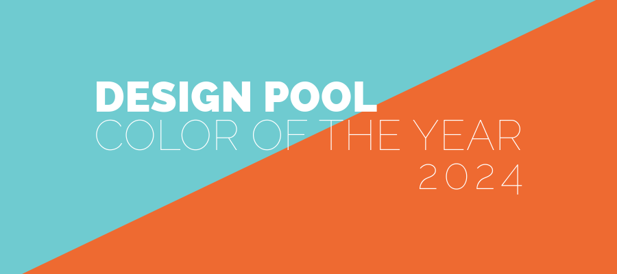
Design Pool: Energizing Orange & Balanced Blue
This year, Design Pool founder Kristen Dettoni chose two colors for our picks, Energizing Orange and Balanced Blue. The colors were meant to evoke energy and optimism while grounding the energy with a complementary color for balance.
What about you?
How are you feeling about the 2024 Colors of the Year? How would you express those feelings through color? We’d love to hear your thoughts. Leave them in the comments or tag us on Instagram to show us. And don’t forget, you can always search the Design Pool licensable library by color. If you don’t find the perfect shade, reach out to work with us on a custom color.
Share this post
Author
DESIGN/COLOR TRENDS AND AWESOME INFORMATION IN YOUR INBOX
Sign up for our monthly trend letter