2020 Spring Runway Color Trends
At Design Pool, we love tracking trends, and color is one of our favorite trends to track. Color is such an integral part of our day to day business and color trends are constantly providing direction and inspiration to our designers as they color designs for the market’s end-use. Over the years, we have learned that most color trends begin their life cycle on the runways of major fashion houses and by the color experts at companies such as Pantone. Paint companies such as Behr and Sherwin Williams also weigh in with their trend predictions, as well as organizations such as Color Marketing. Yet, there is something extra special about watching the newest runway collections; seeing the next new colors in motion. That’s why we’re turning our eye to the 2020 spring runway shows to see what colors are showing up.
Despite being surrounded by color everywhere we go, the average consumer has their favorites, but doesn’t give much thought to how it got there. In The Devil Wears Prada Miranda Priestly chastises Andy Sachs for being unaware of how color moves into the marketplace and becomes a trend. “Oh. Okay. I see. You think this has nothing to do with you. You go to your closet, and you select, I don’t know that lumpy blue sweater, for instance, because you are trying to tell the world that you take yourself too seriously to care about what you put on your back. But what you don’t know is that sweater is not just blue. It’s not turquoise. It’s not lapis. It’s actually cerulean. And you’re also blithely unaware of the fact that in 2002 Oscar de la Renta did a collection of cerulean gowns.”
In defense of Andy, we all perceive color differently and it can be very subjective and very personal. And, while we had fun tracking the 2020 spring runway shows, we promise we are not nearly as intense as Miranda.
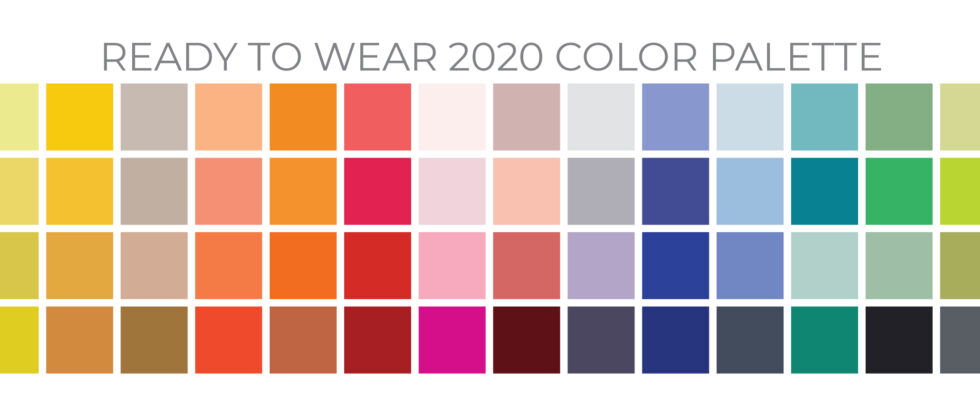
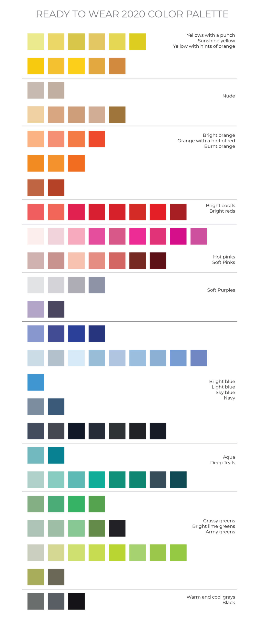
So, what are we seeing? Here are our latest findings from the 2020 spring runway shows:
NEON
We noticed a lot of neon! Extremely saturated, bright, fluorescent colors are being used overall and as accents within a print. These are eye-catching colors and are incorporated very well into the styles.
TAUPE, MUSHROOM
Call it what you like, but it was the breakout color. It was all over the place, used by many different designers. Move over grey, warmer neutrals are pushing their way in. You can see this color in the following runway shows: Max Mara, Miu Miu, Salvatore Ferragamo, Simone Rocha, and Stella McCartney, to name a few.
COLOR INTENSITY
Color in all different color families is deeply saturated and intense.
YELLOWS
Yellows ranged from bright sunshine to hues that had hints of orange.
ORANGE
Oranges were bright and learning toward the red side of the color wheel. When they weren’t bright, they were feeling a bit burnt and dusty, leaning towards terracotta.
RED / PINKS
Reds were very saturated and intense, and the pinks were not far behind. They ranged from intense fuchsia to pale clay tones.
BLUE
By far, blue is the most extensive palette this year, with all shades and intensities. There was a lot of navy (perhaps foreshadowing Pantone’s color of the year), as well as light blues and blues with a hint of purple.
AQUA / TEAL
We have a special love for the aquas and teals this year. The palette was saturated and ranged from lighter hues to deeper.
GREEN
Green was a bit more focused this year, with the most popular shade being a light citrine green. In addition, we spotted grassy greens and a couple of khaki shades.
GRAY / BLACK
Gray did not dominate the runway as in years past, but gray and black are staple colors and will always have a place in fashion. This year they seemed punctuated with pops of color.
PURPLE
Prince would be as sad as we were, but we didn’t see too much purple. Where we did see it, it was very close to the blue side.
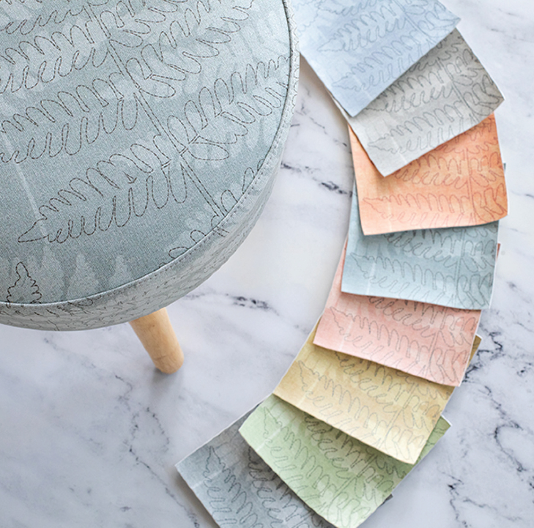
As they tend to do, we expect to see all these color trends trickle down into home furnishings and commercial interiors in some way. Some color trends will likely be used more as accents, such as the neons, while others will have a bigger impact. Those mushroom, taupe shades will surely be a big part of commercial and residential interiors.
Do you follow us on Pinterest? We create trend boards each year to share trends that we’re spotting. Check our first one for 2020, it’s all about feathers. And while you’re there, don’t forget to follow us!
Share this post
Author
DESIGN/COLOR TRENDS AND AWESOME INFORMATION IN YOUR INBOX
Sign up for our monthly trend letter