

Basic Color Terms Defined
Like any discipline, color has a language. To work with color confidently, it is helpful to learn that language. Thankfully, it’s not complicated. Knowing a handful of basic color terms is all you need to understand what people are saying about color. A firm understanding of these terms will help in both working with color and communicating about color with other people, such as designers and printers.
First, there are two ways to create color.
Additive Color Mixing
Additive color mixing refers to mixing color with light. The broadest bands of color seen in the spectrum are red, green, and blue. These three colors are light primaries. If these three colors are projected and overlapped, they will create white light. Additionally, where red and green mix, it makes yellow. Red and blue make magenta, and blue and green make cyan. Yellow, magenta, and cyan are light secondary colors.
Subtractive Color Mixing
Subtractive color mixing refers to paints or dyes mixed together to create color. Rather than mixing wavelengths of light, combining colorants creates new colors by removing or subtracting wavelengths of light.
Definitions of Common Color Terms
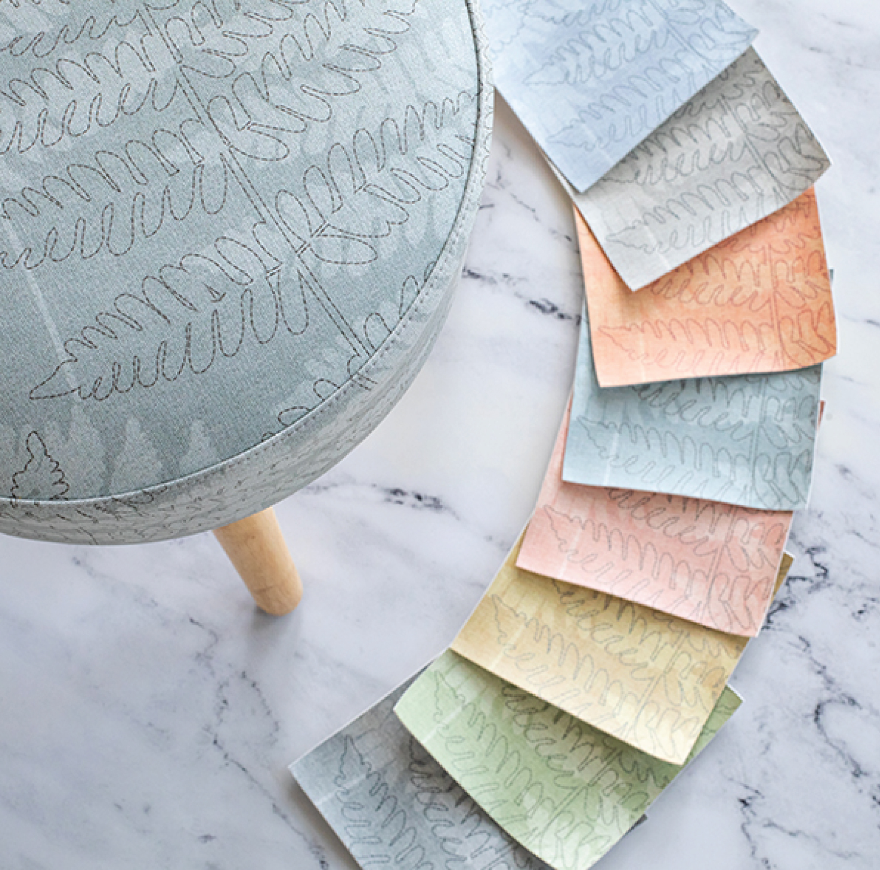
Artists and designers discuss reflected color, what your eye sees, using four main color terms: hue, value, saturation, and temperature.
Hue
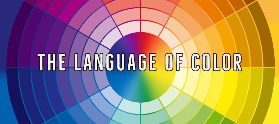
Hue is the name of a color and identifies it to a color or color family. A basic color wheel is a valuable tool when thinking about hue. A color wheel contains three primary colors (yellow, blue, red), three secondary colors (green, violet, orange), and three tertiary colors (yellow-green, blue-green, blue-violet, red-violet, red-orange, yellow-orange).
Value
Value refers to the degree of lightness or darkness of a color. To visualize value, think of a grayscale with white and black at either end and shades of gray from light to dark in between them. Those shades represent value.
Saturation
Saturation, sometimes referred to as intensity, refers to the purity of a color. Think about saturation in terms of how bright or dull a color is instead of how light or dark. (That’s value.) A pure color is fully saturated. If that color is mixed with black, white, or an additional color, it becomes less pure and less intense.
Temperature
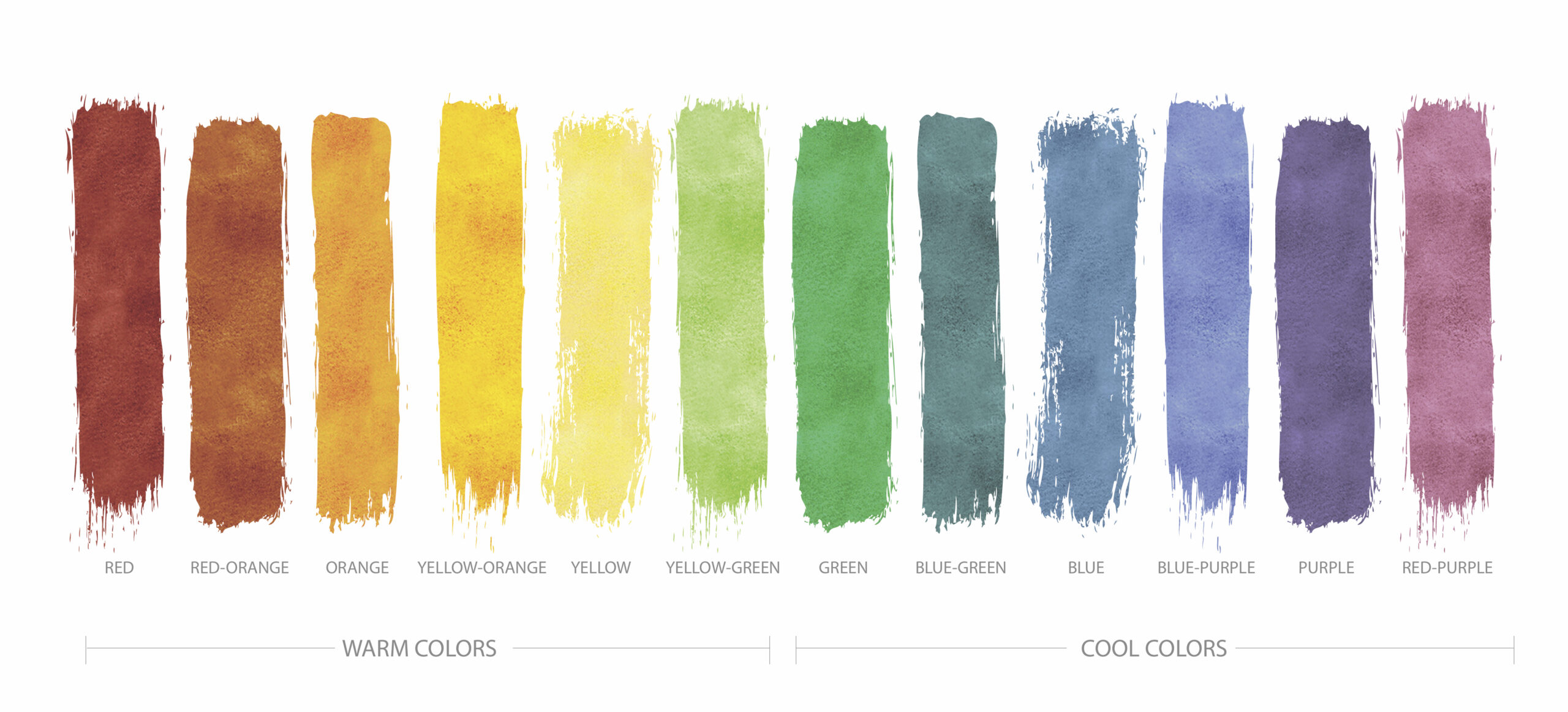
Color is often referred to in terms of warmth or coolness, especially in relation to the surrounding colors. Typically, yellow, orange, and reds represent warmth. Likewise, green, blue, and violet represent coolness.
No one creates beautiful work by accident.
Experienced and talented designers have extensive knowledge of color and a firm grasp of their tools. Designers of all disciplines work with these different attributes of color in various combinations to create the desired effect. Working within an understanding of basic color theory, designers then consider hue, value, saturation, and temperature. For example, designers think about what value they want the hue they are using to be. Do they want a dark red or a light red? How will that hue in that value interact with the surrounding colors? How will that impact its temperature? By paying close attention to all these elements of color, designers and artists thoughtfully make a beautiful final product.
Learning the language of color is key to communication.
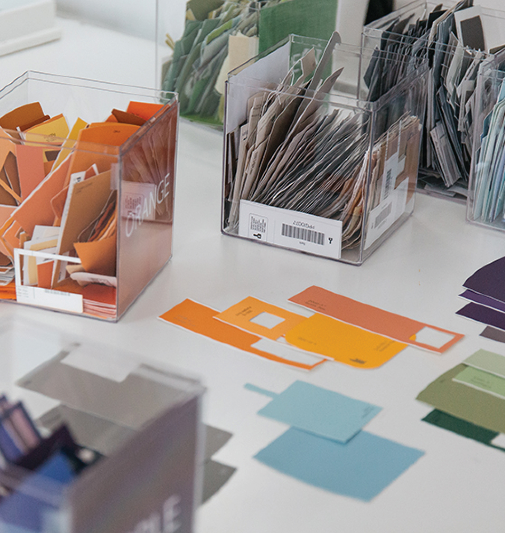
Finally, using these terms is incredibly useful when communicating about color to other designers or printers. For example, after seeing a printed sample, a designer might want the color lighter in value or stronger in intensity. An experienced designer and printer can communicate that clearly.
Recommended Reading: Color and Fiber by Patricia Lambert, Barbara Staepelaere, Mary G. Fry
Share this post
Author
DESIGN/COLOR TRENDS AND AWESOME INFORMATION IN YOUR INBOX
Sign up for our monthly trend letter