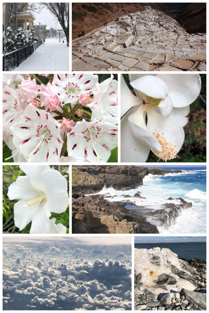
White: Renewing and Refreshing
White offers a sense of reflection and renewal in both life and design. Learn how to capture the sense of optimism and positivity this color can offer in your commercial design choices.
“White. A blank page or canvas. His favorite. So many possibilities…”
Stephen Sondheim, Sunday in the Park with George
Color Meaning
The color white is generally associated with positive feelings of peace, hope, and clarity. It is also often considered a neutral color that can evoke feelings of cleanliness, sophistication, and simplicity, helping you feel refreshed. Also, it evokes feelings of new life and optimism: offering an opportunity for a clean slate to start anew.
However, there are some negative connotations with this color as well. When used in excess, white can feel cold and unfriendly, creating a sense of emptiness. Additionally, large amounts can leave a space feeling a little boring and impersonal.

Fun Facts
In Western cultures, the color white evokes feelings of positivity and renewal. This is one of the reasons it is a color often worn by brides. However, it was not always worn during weddings in Western cultures. The first white wedding dress was recorded in 1406, but it is believed that the color was popularized by Queen Victoria at her wedding in 1840, where she wore a white lace gown, which was seen by many at the time to be breaking with tradition. In many Eastern cultures, white is associated with death and sadness, and rather than weddings, it is used in funeral and mourning rituals.
Using White to Refresh Your Space
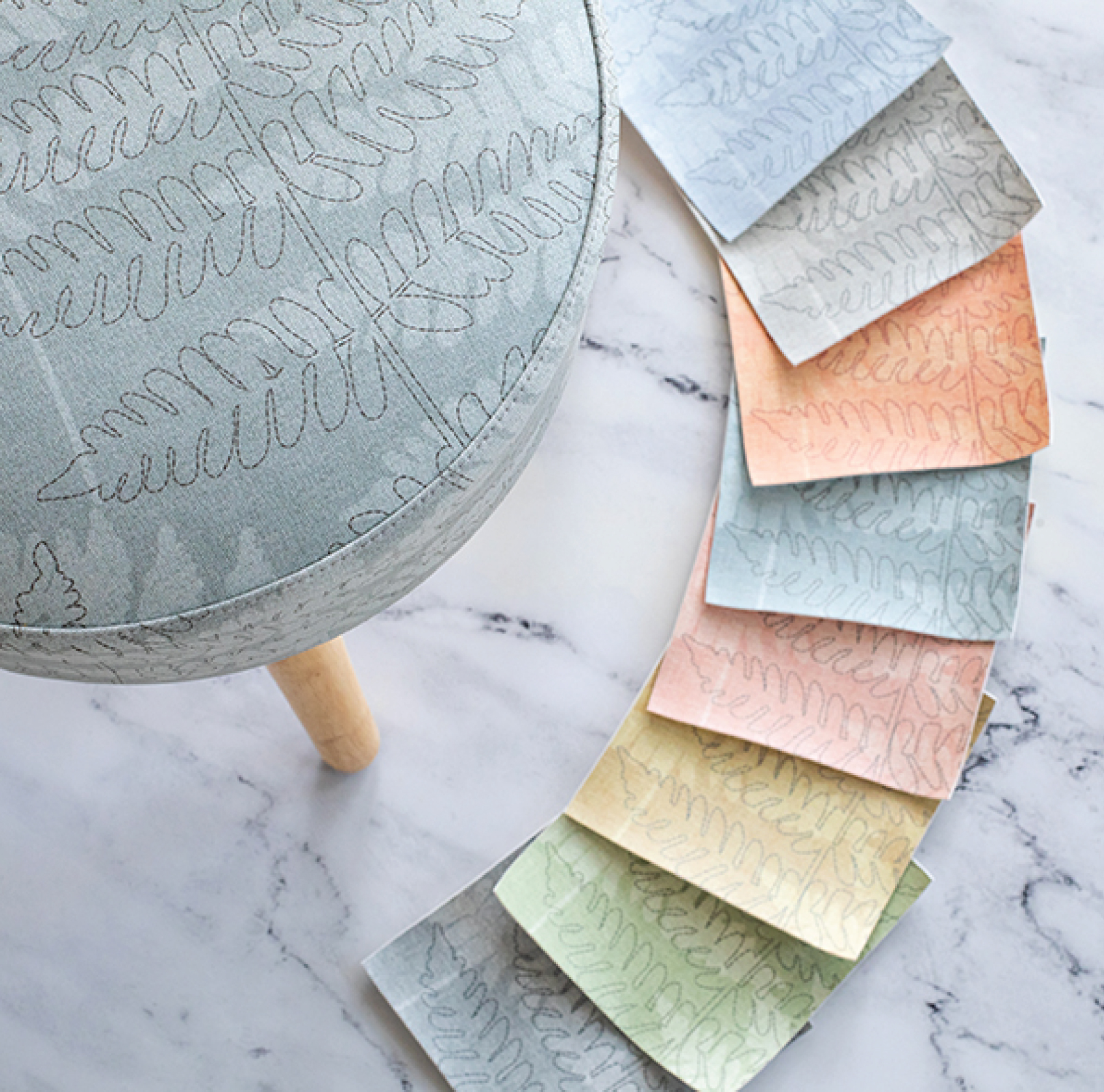
Although white in excess can cause spaces to feel a little cold and impersonal, overall, the color can add a refreshing quality to your spaces. Designers often use it as a good base color for walls in any space, then add pops of color for variety and character. It is often associated with minimalism, keeping the design of the space simple, clean, and reflective of natural light. In a practical sense, designing with white makes a space easy to sell and transferable for many uses or clients. Some interior designers also pair it with natural elements such as wood and greenery to bring the feeling of nature indoors. Since it is such a universally used color in design, it’s a safe choice for any room or purpose.
Have you used white in any of your commercial projects? We love working with color and seeing how you use it. Tag us on Instagram with your favorite projects! For more inspiration, check out our color board on Pinterest.
Share this post
Author
DESIGN/COLOR TRENDS AND AWESOME INFORMATION IN YOUR INBOX
Sign up for our monthly trend letter


