

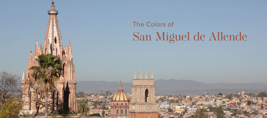
San Miguel de Allende Color Inspiration
I just got back from a week in beautiful San Miguel de Allende. This small city in the central highlands of Mexico took my breath away, and not just because of the altitude. The colors, the food, the people, the blue sky (it had been a while since I’d seen that in wintery New England) all combined to deliver a relaxing and inspiring trip. As usual, I brought a travel journal along with me to record my impressions and inspiration.
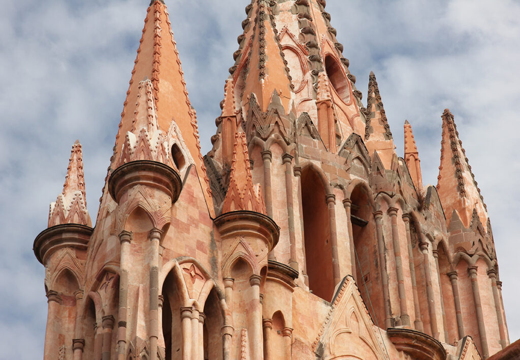
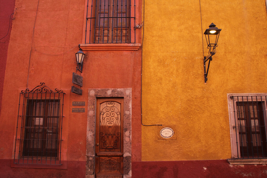
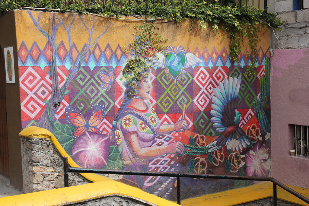
What struck me right away about San Miguel de Allende was how colorful this city was. Also, how much those colors changed depending on the time of the day. Buildings such as the central church, La Parroquia de San Miguel Arcángel, changed from tan to gold to pink depending on the sun. The buildings along the cobblestone streets were painted with colors that all seemed to grow straight out of the earth. Rich reds, deep golds, and dusty pinks created a beautiful palette.
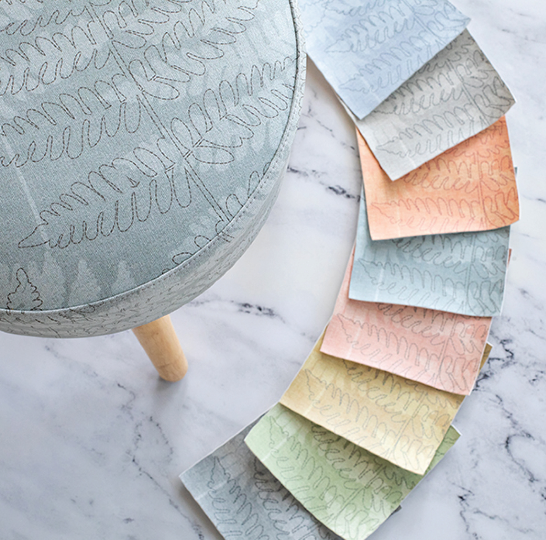
Capturing the San Miguel de Allende palette.
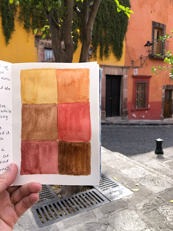
One afternoon, while my husband had a siesta, I parked myself in a small park with my watercolors to try and capture this city’s color palette. First, I focused on the buildings along the street where I was sitting. I don’t draw street scenes well at all. Instead, I just paint squares of color. This practice gives me time to really look at the colors and think about what goes into them. What colors do I need to mix to try and hit those colors?
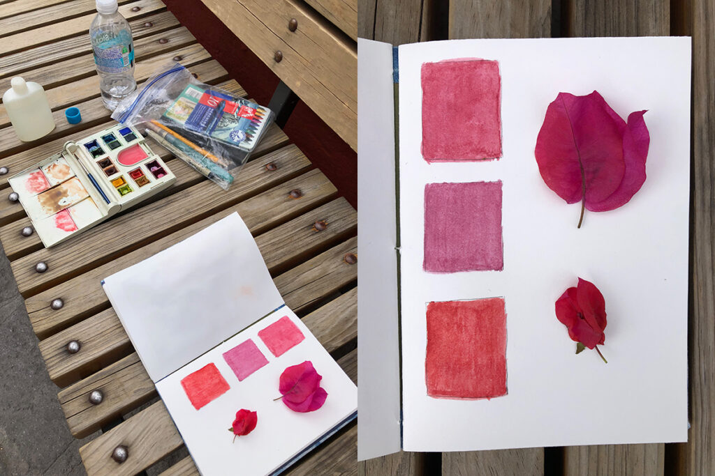
While sitting there, I also picked up a few bougainvillea blossoms that had fallen nearby. San Miguel was full of these beautiful plants everywhere. I can only imagine what the city looks like when these are in peak bloom. The colors are so bright and vibrant. In addition, the construction of the blossom makes them almost glow with a translucence.
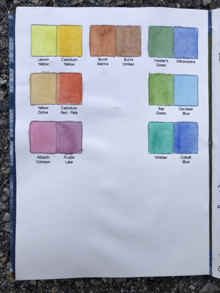
I’ve traveled with a journal since my first trip abroad when I was 22, yet this is only the second time I’ve included a paint legend at the beginning of my journal. In Illustrator, I made a graphic mirroring the pans in my watercolor set and painted each shape with the corresponding flat color. It is so helpful. When looking to match a color, I referenced this key to make smart decisions about which colors to use. This is definitely a feature I’ll be including in all my future journals.
But I’m a weaver, not a painter.
I’ve been playing around with small looms for the past couple of years. It all started with a tiny Hello Loom that I bought and took with me on walks around Rhode Island. I loved it and brought it with me on a trip to Kauai. Since that initial purchase, I have started learning more about tapestry weaving and using weaving to create imagery. Artist Rebecca Mezoff, whose online classes I’ve enjoyed, speaks of tiny tapestries she makes on hikes as “sketch tapestries.” I love this idea of fast weavings that capture a color or a mood without the pressure of a finished product.
With this in mind, I added my tiny loom and small reelings of tapestry yarn to my travel kit. (I had guessed at which colors to bring based on photos I’d seen of SMA.) During another of my husband’s siestas, I wove one small tapestry on my Hello Loom. In this weaving, I aimed to capture something I loved about the buildings here, how they combined different colors strongly, with clear separations such as maroon on the bottom and gold on top. The beauty of using such a tiny loom is I can’t do too much. I need to figure out how to express an idea simply and quickly.
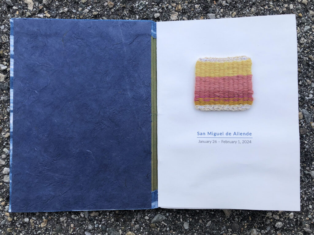
Ultimately, I just love this tiny little cloth! It’s only 2″ square and now lives on the title page of my journal.
The pace of this trip allowed me to slow down, enjoy the light, pay attention to the colors, and play with my loom. After this trip, I’m sure of three things: always add a paint legend to my journal, take the time to make an educated guess about what color yarn to bring, and encourage afternoon siestas.
Share this post
Author
DESIGN/COLOR TRENDS AND AWESOME INFORMATION IN YOUR INBOX
Sign up for our monthly trend letter