
Orange: Spontaneous and Playful
One color that encapsulates the happy, bright, and energetic quality of days in the summer sun is orange. Traditionally a color low on the popularity scale, it is making a comeback in pop culture and bringing joyful energy into our hearts through fashion and home decor. Read on to learn more about the meaning behind this color, its history, and how best to incorporate it into commercial interiors.
Meaning of Orange
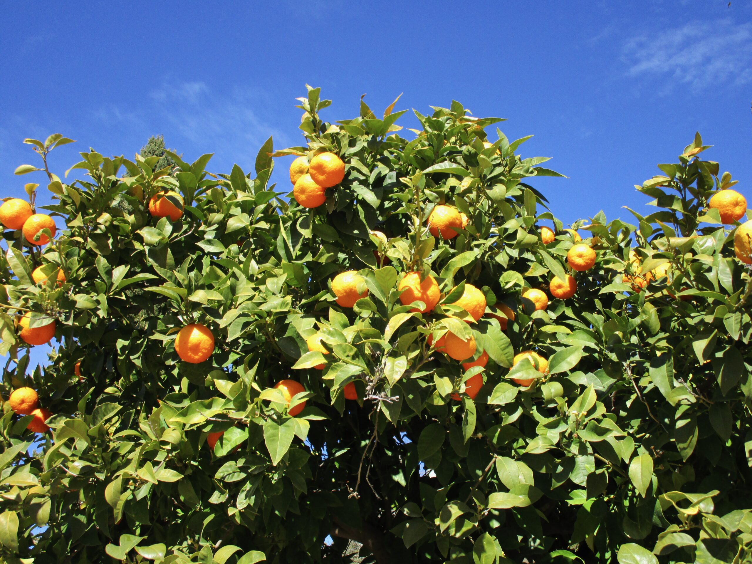
Orange is a color that grabs your attention. In its traditional hues, it is high-energy, vibrant, joyful, and positive. These traits make it a very social color, often associated with youth, adventure, and creativity. Combining the joy of yellow and the power of red, orange brings about feelings of happiness while dramatically drawing our attention. Orange connects us to nature as well. We see it in summer sunsets, fall foliage, Halloween pumpkins, and various fruits and vegetables all year round.
Throughout History and Across Cultures
Before the 15th century, there was no particular name for this color in Europe. According to Arts & Collections, it wasn’t until the first orange trees were brought to Europe from Asia that the name was associated with this lively color. Before that, it was simply called yellow-red. Orange has also been used in art as far back as tomb paintings by the Ancient Egyptians. Once a synthetic version of the color orange was produced into paint, the color became even more popular with painters, especially Vincent van Gogh, who used the color widely in his paintings.
Orange carries different symbolic meanings across cultures as well. In the United States, the color tends to be a sign of caution, often used in life preservers and construction equipment. In Western cultures, it can carry negative feelings such as excess and arrogance when used in large amounts. However, the opposite is true in many other cultures and religions. In many Asian religions, orange is a holy color, worn by Buddhist monks in their robes and symbolizing transformation in Confucianism. It carries many different meanings and layers of significance worldwide. So, how can you begin to think about designing with this complex color?
Designing with Orange
Designing with orange requires some careful planning. When used excessively, it can be overpowering and bring a superficial feeling to your spaces. It’s best to start by using it in small amounts as an accent color. It’s also important to consider the hue and tone you might use depending on the space you are designing. For example, brighter shades provide high levels of visual stimulation and feelings of excitement, while softer shades offer a cheerful and cozy feeling. Or, pair it with its complementary colors, blue and purple, to add a more contemporary feel. Some common commercial spaces where you might find this color include office spaces, gyms or fitness centers, and department stores.
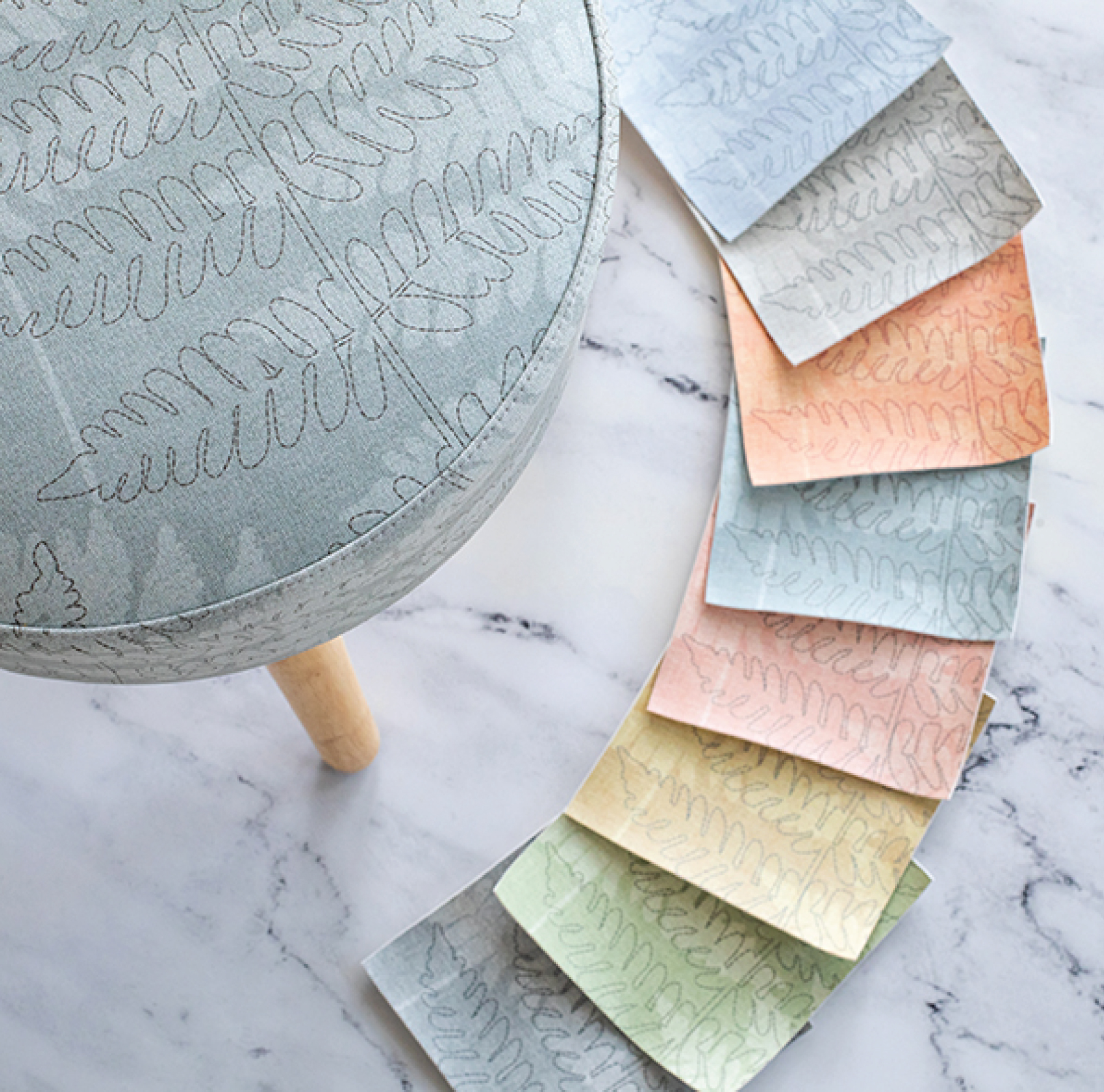
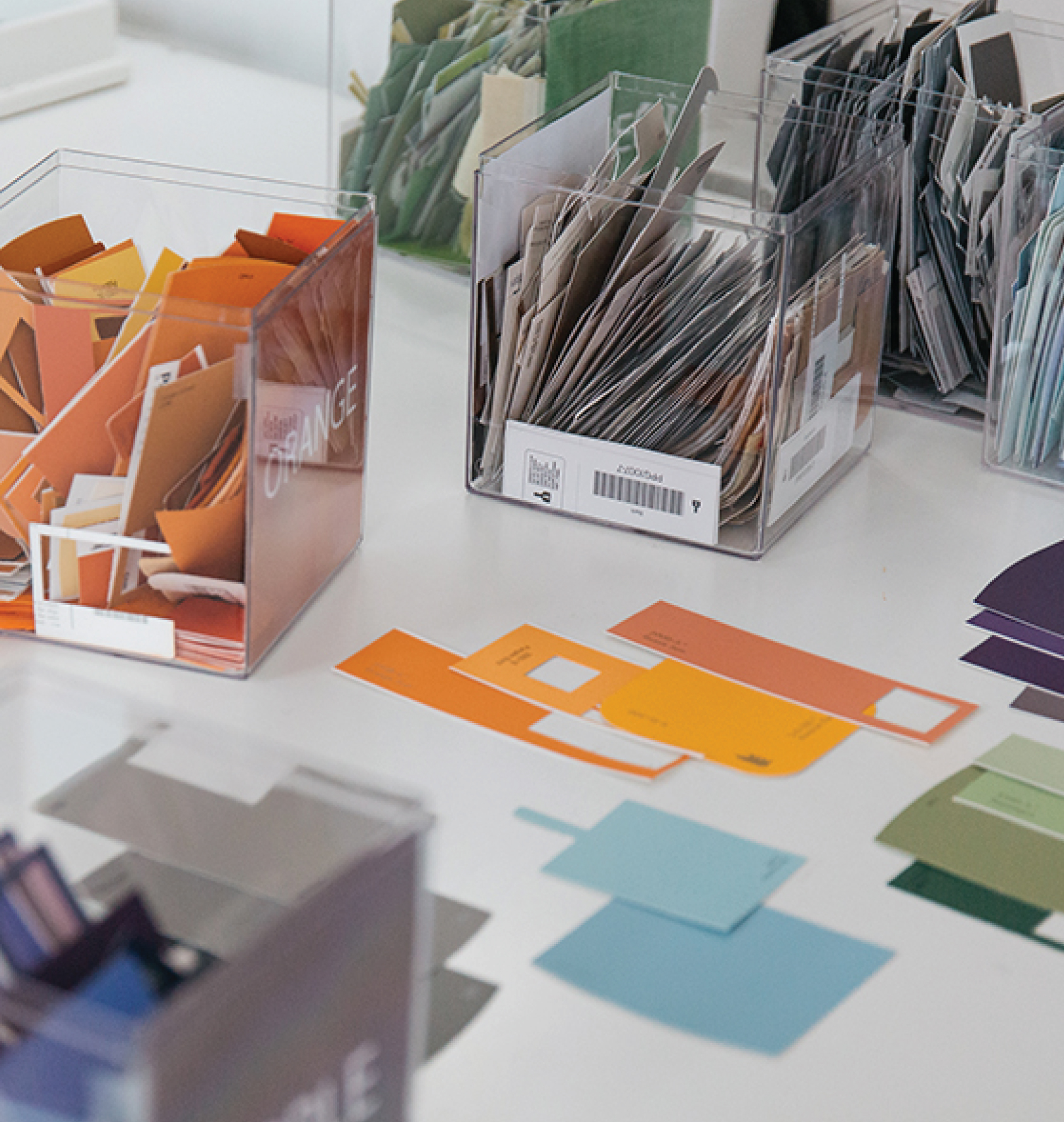
Have you used orange in any of your commercial projects? We love working with color and seeing how you use it. Tag us on Instagram with your favorite projects! Don’t forget, you can search the Design Pool licensable library by color.
Share this post
Author
DESIGN/COLOR TRENDS AND AWESOME INFORMATION IN YOUR INBOX
Sign up for our monthly trend letter