Spring 2022 Runway Color Trends
Every year, spring marks a time of awakening. Flowers bloom, birds sing, trees grow leaves. Humans and animals emerge from the dark days of winter. It’s a season of rebirth, renewal, and hope. As we pored through photos from the Spring 2022 Ready-to-Wear collections, there was a noticeable feeling of hope and optimism.
Two years after the beginning of the COVID pandemic, people are feeling a sense of (sometimes cautious) optimism. People are starting to travel again, go to theaters, and gather with each other. Designers are embracing that optimism. Throughout most collections, there was an overarching sense of joy and hope. They served us collections full of flowers, butterflies, and bright colors. Feminine touches such as ruffles, lace, and bows abounded. Many textile choices felt breezy, flouncy, and romantic.
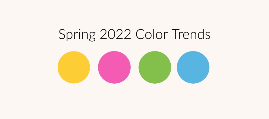
Just as the design and textile choices felt hopeful, so did the colors. Runways this season were full of color, both bold and bright, and softer pastels.
Spring 2022 Color Trends
Bold Colors
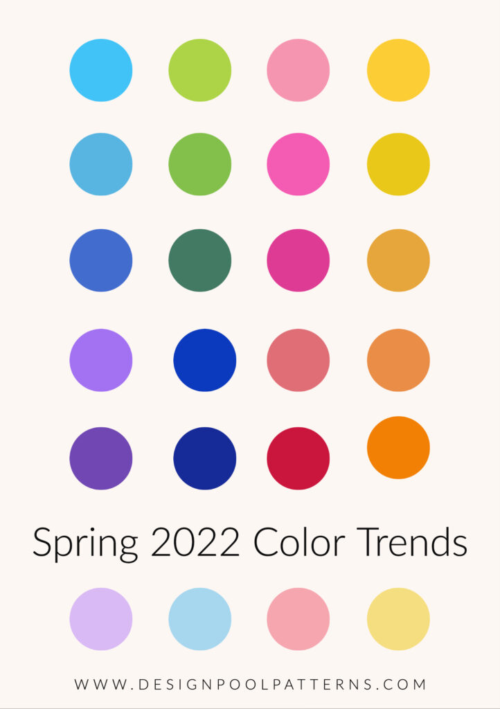
Yellow, pink, and green dominated many of the collections. Often used as a striking solid, these bold colors sometimes accented a neutral but often were used alone for a bright blast of fun color. Aqua, royal blue, and beautiful reds round out a full and vibrant spectrum.
Soft Colors
It wasn’t all bold though, there were lots of softer colors and pastels mixed in. The pastels though were beautiful rich colors, not the saccharine sweet pastels can sometimes fall into. They were not washed out or toned down, just softer. Butter yellow, soft blue, lilacs, and corals.
Neutrals
For neutrals, black, white, and black and white together were still dominating, but complimenting the black and white were lots of bold, bright, happy colors. Even when used alone, the choice of textile or garment design offered a softer touch to keep black from being too harsh. Warmer neutrals, rich browns, and ivories were often what complimented the softer colors. Sometimes the lighter neutrals and ivories mix together on their own.
Plus, there were digital prints.
Another trend we couldn’t help being attracted to on the runway was digital prints. Some designers are really embracing the possibilities that come with this technology. Thom Browne took it to some strange places, while Alexander McQueen used it for dreamier looks. This technology makes possible both engineered designs and images not possible with previous methods of printing. It will be exciting to see where this trend goes.
Researching fashion colors always gets us wondering which colors will eventually appear in home furnishings. Which colors do you think we’ll see first? Let us know in the comments, or DM us on Instagram.
If you want to reference these colors, we put together a handy color reference card for you. This card features the top colors we spotted, along with their hex numbers.
Share this post
Author
DESIGN/COLOR TRENDS AND AWESOME INFORMATION IN YOUR INBOX
Sign up for our monthly trend letter

