
Spot Color or Process Color
For designers, our work speaks through color. On its own, the language of color can sometimes be confusing. So too can the language of printing that color. When printing, printers apply color to a surface in two different ways. A printer either uses spot color or process color. Neither process is superior; they’re just different. Choosing which method to use depends on what works best for your project. In order to make the right decision, you must first understand the difference.
So, what’s the difference between spot color and process color?
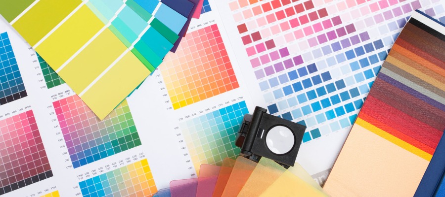
Spot colors are solid colors printed with a specific premixed ink. Using the Pantone standardized color system, printers in different locations and with different companies can achieve an exact color every time.
In general, spot colors are often known to be bold and vibrant. Designers use spot colors when their project requires few yet exact colors. For example, when printing a logo on branding materials.
Process color uses four ink colors: cyan, magenta, yellow, and black in millions of tiny dots. These overlapping dots of color blend together to create a full spectrum of color. This type of printing is also known as the CMYK process. Printers communicate process colors as percentages of cyan, magenta, yellow, and black ink. By varying these percentages, thousands of color options can be created.
Process color is well suited for printing images such as photographs or colorful artwork that require a range of shades and hues.
Which method is better?
Neither method is better. Instead, they each have their benefits and drawbacks. Also, keep in mind that very often, these two processes are combined. For example, a company may print a colorful brochure full of photos using process color and then use spot color to print their logo in their exact color.
Equipped with the knowledge of spot color or process color, let your project dictate which choice is better for your end purpose.
Share this post
Author
DESIGN/COLOR TRENDS AND AWESOME INFORMATION IN YOUR INBOX
Sign up for our monthly trend letter