Learn About Color with 5 Fun Exercises
Color surrounds us, inspires us, and influences us. You can read about color science and color theory all day long, but the best way to work better with color is to play with it. The more you learn about color through experiencing it, the more you’ll train your eyes and use it better in your work. With a better understanding of how colors interact with each other, you can effectively use color to influence a mood or a setting. We love color and have rounded up five of our favorite exercises for learning more about color. Before you get started, I recommend you read these two interesting posts on how our eyes see colors and how we perceive color if you haven’t already.
But first, a word about tools.
These exercises don’t require any art experience or special supplies. The only thing you need is curiosity and your eyeballs. If you have absolutely no experience with art supplies, I suggest starting with whatever tool you find the least intimidating, such as crayons or markers. Move up from there to basic watercolors or gouache when you feel comfortable.
5 Exercises to Learn About Color:
Make a Color Collection.
This is a fun exercise and requires no tools at all. Pick a color and gather as many examples of that color as you can find. Flip through magazines, walk around your house or go for a walk in your neighborhood with your eyes peeled for that particular color. When you’re done, look at all the different examples of that color you have. Think about how the color you chose interacts with the colors that surround it. If it is used on a product, what kind? In an ad, what is it selling? In a room, how?
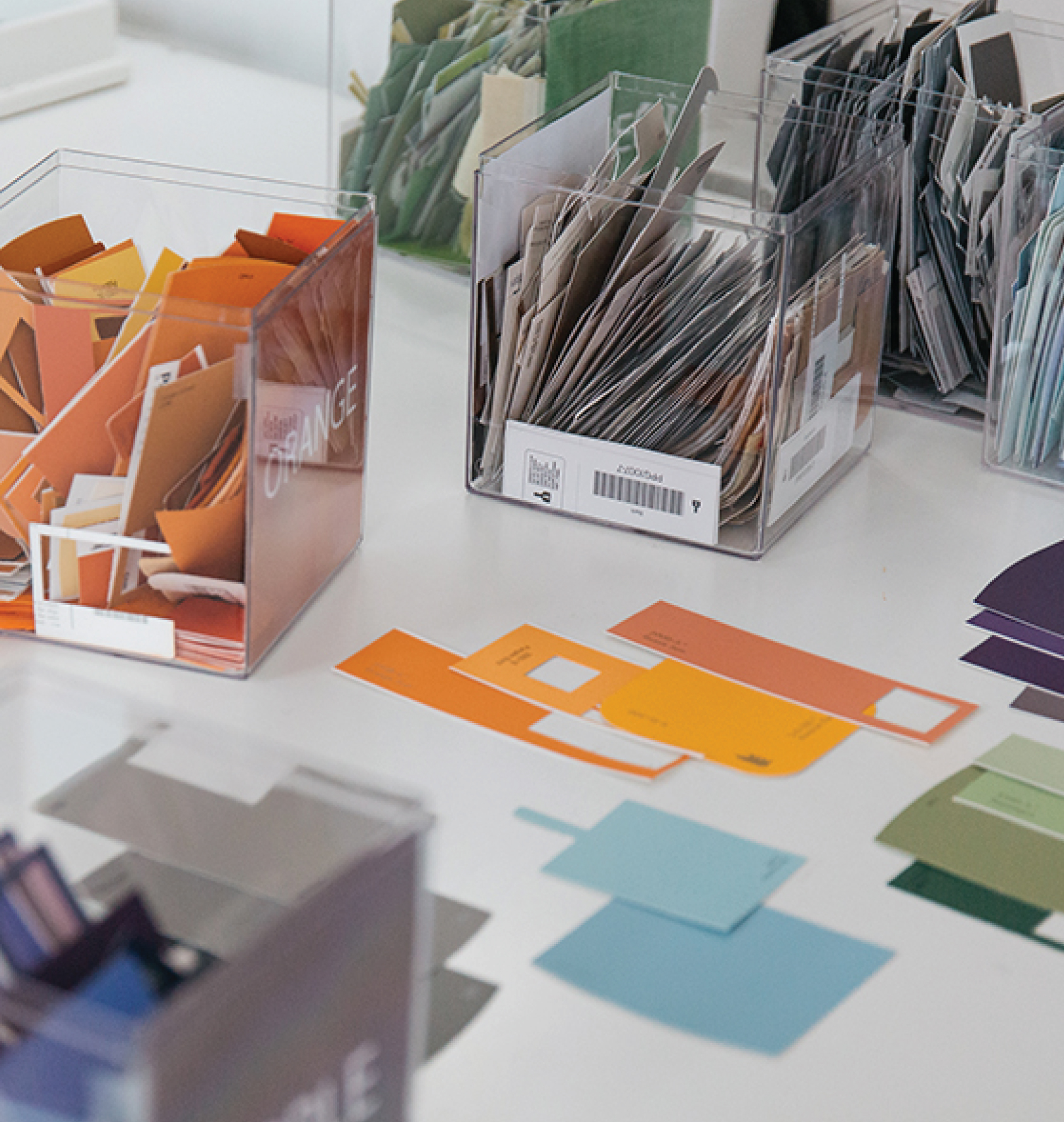
Organize by Color.
This is another fun and tool-free exercise. Choose something in your life that needs organizing and organize it by color. If you’re a knitter or sewer, use your yarn stash or thread spools. Other fun stuff to organize is books on a shelf, spices in your kitchen, or ties in the closet. Start by putting the items in basic groups by color. Then within each color try to break them down even further. For example, within your greens, put all the lime greens together and forest greens together. Can you then arrange these items in order: red, orange, yellow, green, blue, purple? This will force you to look at the greens and wonder if they’re a little more yellow or a little more blue. Bonus: you just tricked yourself into organizing something!
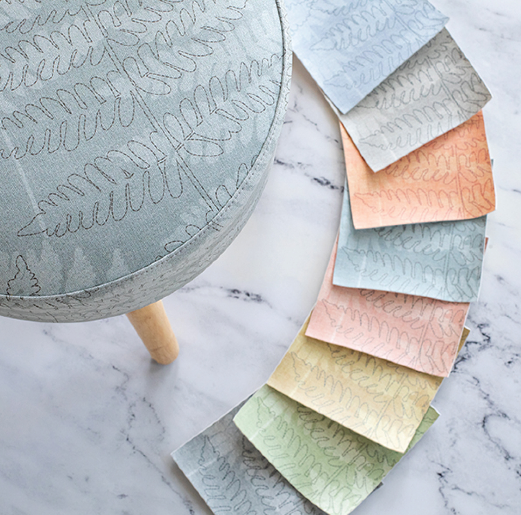
Make a Color Wheel.
OK, time to break out the tools. Using whatever medium you are comfortable with, make yourself a color wheel. To make a color wheel, draw a circle and divide that circle into 6 pieces, like a pie. Color each piece one of the colors of the spectrum: red, orange, yellow, green, blue, purple. Look at your color wheel and label the primary colors: Red, Yellow, Blue. Next, label the secondary colors: Orange, Green, Purple. Each color has its complementary color opposite it on the color wheel. Red and green are complements, orange and blue, and yellow and purple. Colors that are next to each other are known as analogous, such as yellow and green.
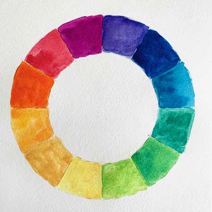
When you’re ready to play with mixing paints, make another color wheel with an extra wedge between each of these colors. Mix your colors to add in red-orange, orange-yellow, yellow-green, green-blue, blue-purple, and purple-red. Now you’re really getting going and already have paint mixed. After your color wheel is made, spend time painting little swatches next to each other. See what the yellow looks like next to the purple, next to the orange. What does the red look like with the blue or with the purple?
Create a Palette Based on Nature
There is a reason artists and designers are constantly drawn to nature. Nature truly is one of the best places to find gorgeous color combinations. Head out on a walk and start looking for a color combination that speaks to you. Start with something easy like a flower for the first time. If the weather cooperates, bring along your sketchbook and make notes or mix colors right there in nature. If not, take a photo of this piece of inspiration and bring it home with you. Next, try to match the colors in this item. Make a little swatch for the red of the petals, the green of the stem, the yellow of the stamen. Name these colors. These little palettes will yield beautiful little combinations and can be used later in other projects.
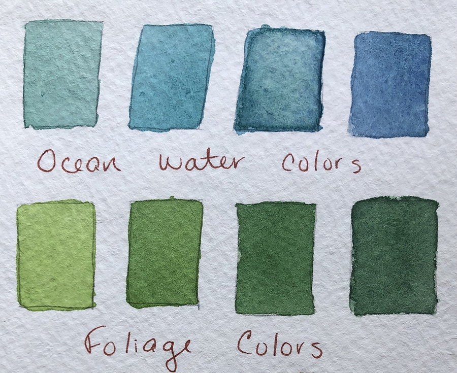
Fun fact: Exercises like this one were the inspiration behind the color palettes we post on Pinterest and Instagram.
Try to Match a Color
This may be the most challenging exercise, but if you’ve done the others, you’ll be ready for it. Get something for a reference that you like and see if you can match that color by mixing your paints. Back in college, we had to do this with a swatch of printed fabric. I’ve heard of other teachers using Starburst candies. Whatever you use, choose something flat, with minimal texture. So, avoid something like a skein of yarn but instead choose a piece of vinyl. Look at that color and think about what other colors went into it to make it. Look at your color wheel and ask yourself: what would be a good starting point? You will learn a lot about color, and your paints, doing this exercise.
When you take the time to learn about color, you get more comfortable working with it. Like any skill set, the more you learn, practice and train yourself, the more effectively you can use that knowledge in your work.
Recommended Reading
I referenced two books for this piece that I love and have found useful in my own work. If you’re looking to experiment more with color, these are both great starting points.
Local Color, Seeing Place Through Watercolor by Mimi Robinson
A Field Guide to Color, A Watercolor Workbook by Lisa Soloman
(Note: These are not affiliate links, I just love recommending good books.)
Share this post
Author
DESIGN/COLOR TRENDS AND AWESOME INFORMATION IN YOUR INBOX
Sign up for our monthly trend letter