
Kristen’s Top Five Favorite Color Tools
Communicating color can be a difficult task. How we perceive color varies from person to person. Yet, when you’re designing a pattern to be printed, you need to find a way to remove those variables. A designer and printer need to communicate color so that what is printed is correct. Therefore, both parties need to be very clear about color. Thankfully, there are many methods and color tools on the market to take the guesswork out of communicating color.
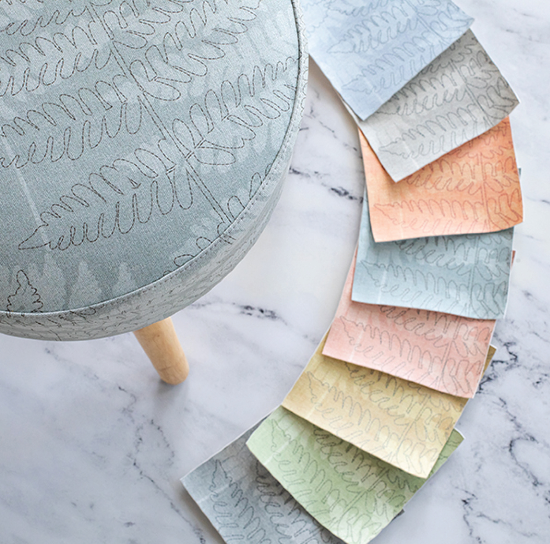
At Design Pool, we work with a wide range of printers (our partners) to print our patterns on a variety of products and substrates. As a result, Kristen is often asked how she gets the color she needs, especially when doing the kind of custom colorwork that requires a precise match. Over the years, Kristen has tried a lot of methods and tools to communicate color and loves sharing her favorites.
Kristen’s Favorite Color Tools!
SPYDER
Spyder, from Datacolor, is a small tool that calibrates the color on your computer monitor. By calibrating your monitor, the color you see on the screen will match the color that prints. To use, you place the Spyder on your screen and run the software. After that, it’s easy to run regularly to keep your monitor calibrated. It is super easy to use and ideal for any designer wishing to see true colors on their monitor. (Which is all of us, right?!)
PANTONE
Pantone continues to be one of the industry standards for color. They make headlines every year when they announce their Color of the Year, but designers across industries use their color books all year long. These color books continue to be a very effective way to communicate color across different industries. Additionally, you can download swatches from their color books into Illustrator and easily choose Pantone colors while creating your AI files.
COLOR REFERENCE LIBRARY
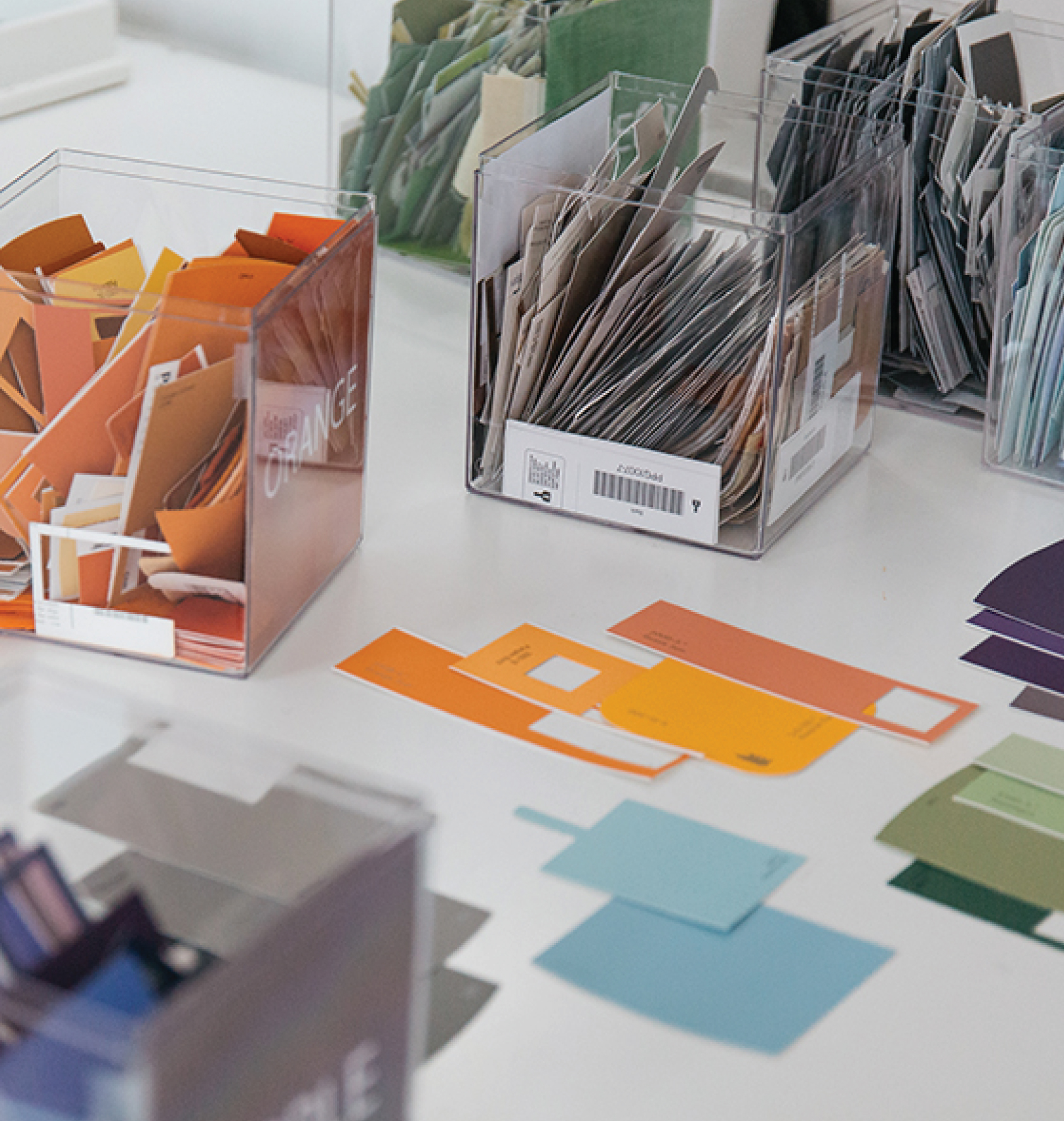
We are always encouraging designers to create their own color reference library. The more color references you have at your disposal, the easier it will be to share a physical representation of a color you’re working with. Paint chips from companies such as Behr and Sherwin Williams are a great place to start when building out your library. Many interior designers are choosing their color schemes based on their paint colors. As a result, having access to those colors is essential for coloring other products for my customers that will be used in these spaces.
RAL COLORS
We recently learned from color, materials and finishing expert Kerry Rowe that RAL colors are the standard for varnish and powder coatings.They are also the standard for industrial finishes, such as the kind on steel shipping containers. Originally consisting of only 40 colors, the RAL Color Chart now offers over 2000 color choices. Similar to Pantone, you can also import RAL colors into Illustrator.
And of course, a great tool is inspiration!
COLOR PALETTE INSPIRATION
Over on Pinterest, we share tons of inspiration for working with colors. We have whole boards devoted to particular colors and are constantly creating color palettes from inspiring images. These palettes provide suggested color combinations and inspiration for pattern coloring. We share one palette every Friday on Instagram, but if you’re really in need of color inspiration we have everything all in one place over on Pinterest.
Interested in learning more about communicating color?
We wrote a more in-depth piece on the topic over on the Color Karma blog.
Share this post
Author
DESIGN/COLOR TRENDS AND AWESOME INFORMATION IN YOUR INBOX
Sign up for our monthly trend letter