

Four Tips for Combining Neutrals in Home Decor
Recently, I interviewed Lisa Lev, of Lisa Lev Design based in Toronto. I asked her, “What is your most challenging, yet satisfying, project to date?” She replied, “the Clarendon job.” This modern rehab of a heritage home for a repeat customer, was challenging for her. This client has a bad reaction to color and Lisa loves starting from the color scheme. But as you can see, Lisa embraced the challenge by combining neutrals to great effect.
Here is what I learned from her about combining neutrals.
1. Let the architectural details speak.
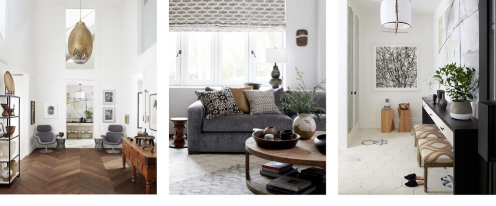
Consider the bones of the space before adding any elements. Is there an architectural detail that can be showcased? Are there arch ceilings or interesting moldings? By starting with these fixtures as the room’s focal point, it is easier not to upstage them in the decorative process. For example, in the Clarendon entrance hall, there is a lovely large-scale herringbone pattern. It may have passed unnoticed if there was additional color in that room.
2. Variety is key to an interesting room.
Even a room devoid of architectural features can be made to have depth and complexity by blending a variety of neutral colors, finishes, and textures. Here are some of the ways that variety can be achieved:
- All colors found in nature can be considered neutrals and assembling many hues together, like multicolored pebbles on a beach, make a place feel vibrant. This can be achieved with the finishes, upholstery fabric, and decorative pillows.
- Wood tones can be inherently varied, such as within that herringbone floor, or with juxtaposed wood furniture of different tints. Wood is also great for warming up that neutral palette.
- Highlighting contrasts also works well to add variety with different forms of texture. Think matte versus polished, smooth versus rough, velvet versus woven, plush versus coarse.
- Black and metallic accents, such as unfinished brass, add much-needed tension to discreet color schemes. Their drama adds richness and depth to a room.
3. Showcase interesting shapes.
Interesting shapes are also key to breaking up monotony. This is where the unusual lighting fixtures, such as the one made of perforated brass in the Clarendon hallway, will shine forth. Even the hexagonal shape of the tiles in the foyer adds to the visual interest.
4. Introduce pattern.
Pattern, even pattern upon pattern, works great in neutral spaces. Simple abstract or organic patterns in tone-on-tone can add visual interest from the floors to the furniture to the walls.
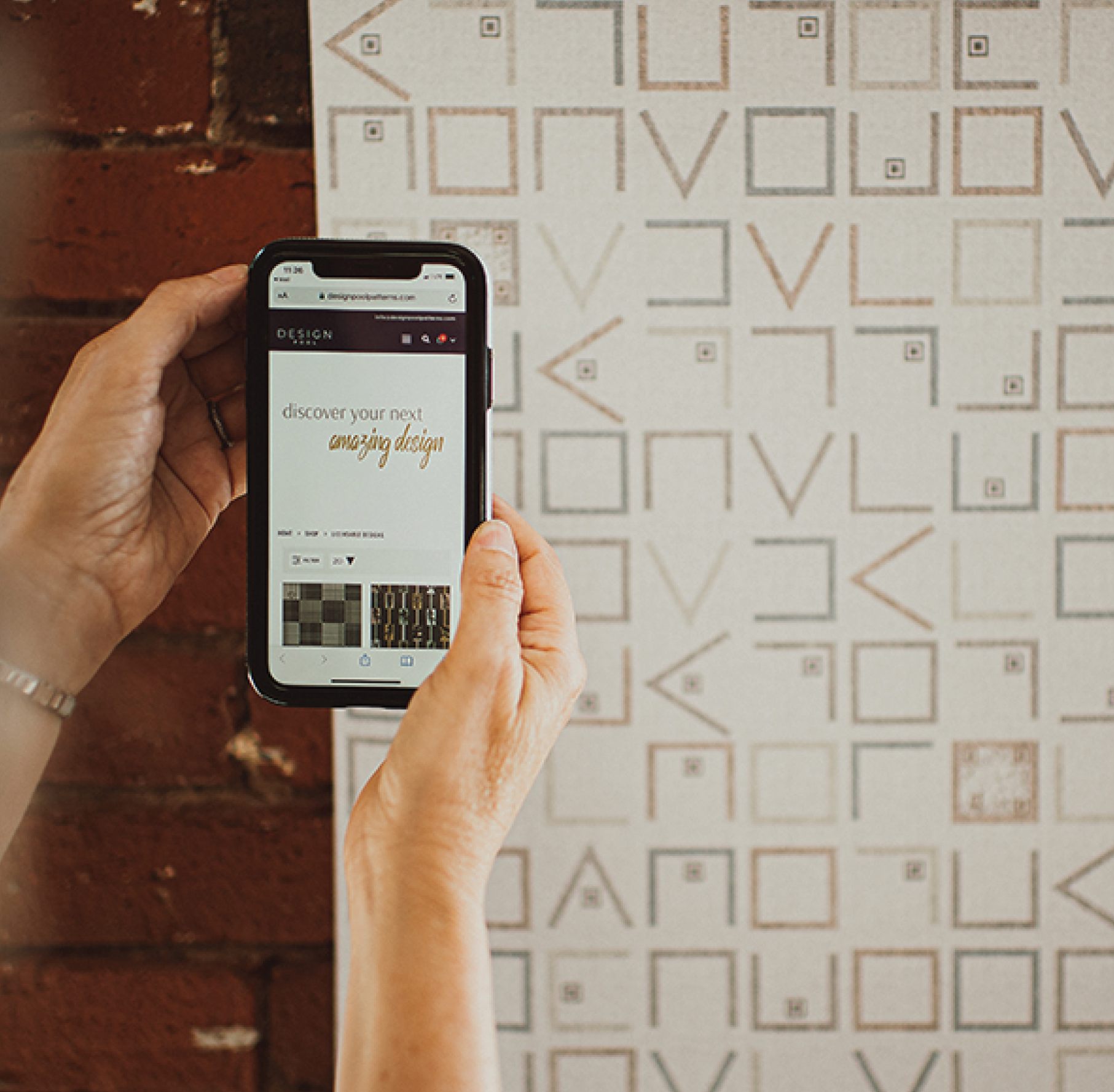
This is where Design Pool can help.
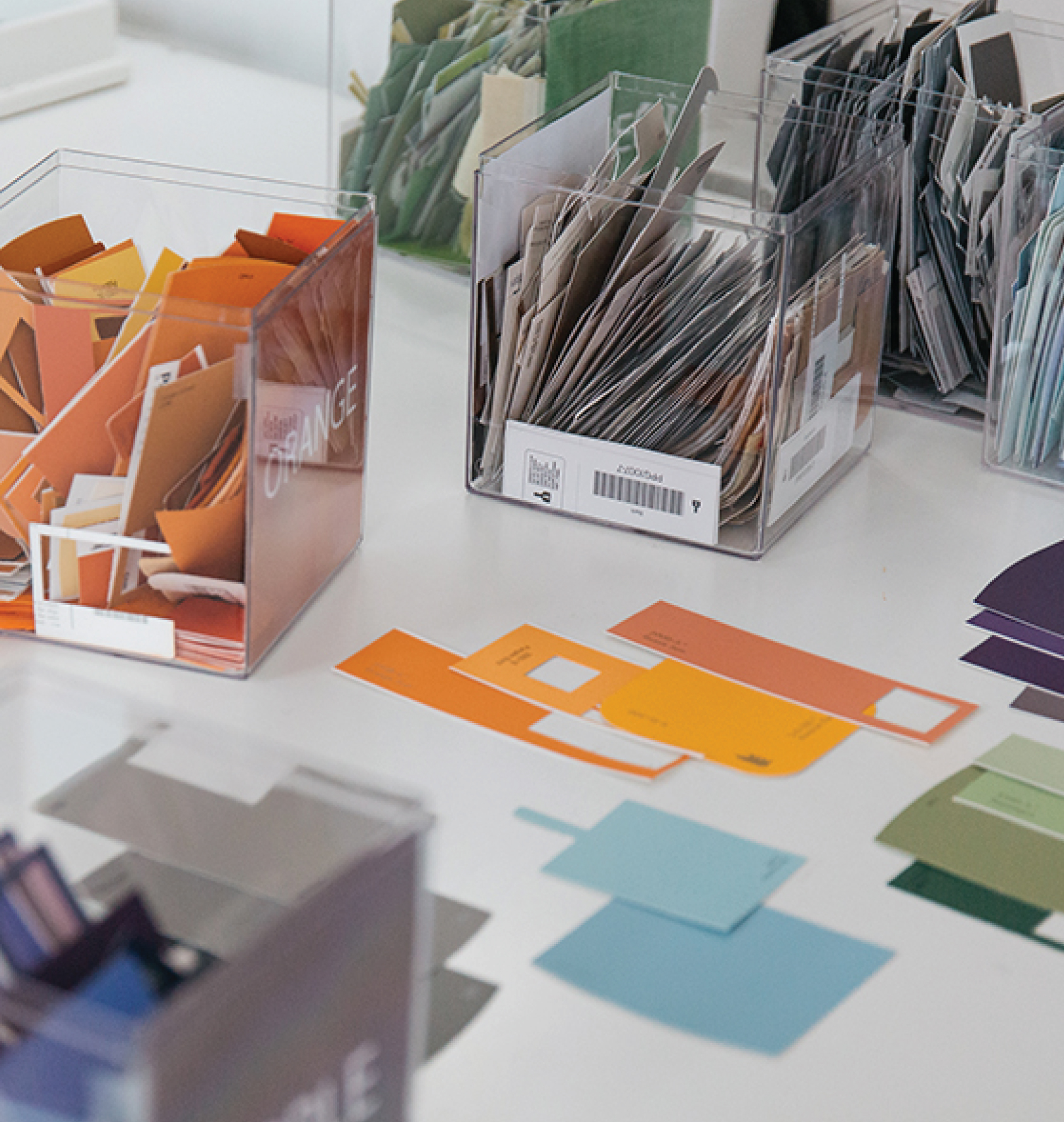
As a digital print-on-demand service company, this is where Design Pool and our affiliated partners can facilitate your decoration needs by providing fabric or printed product in the designs and colors of your choice.
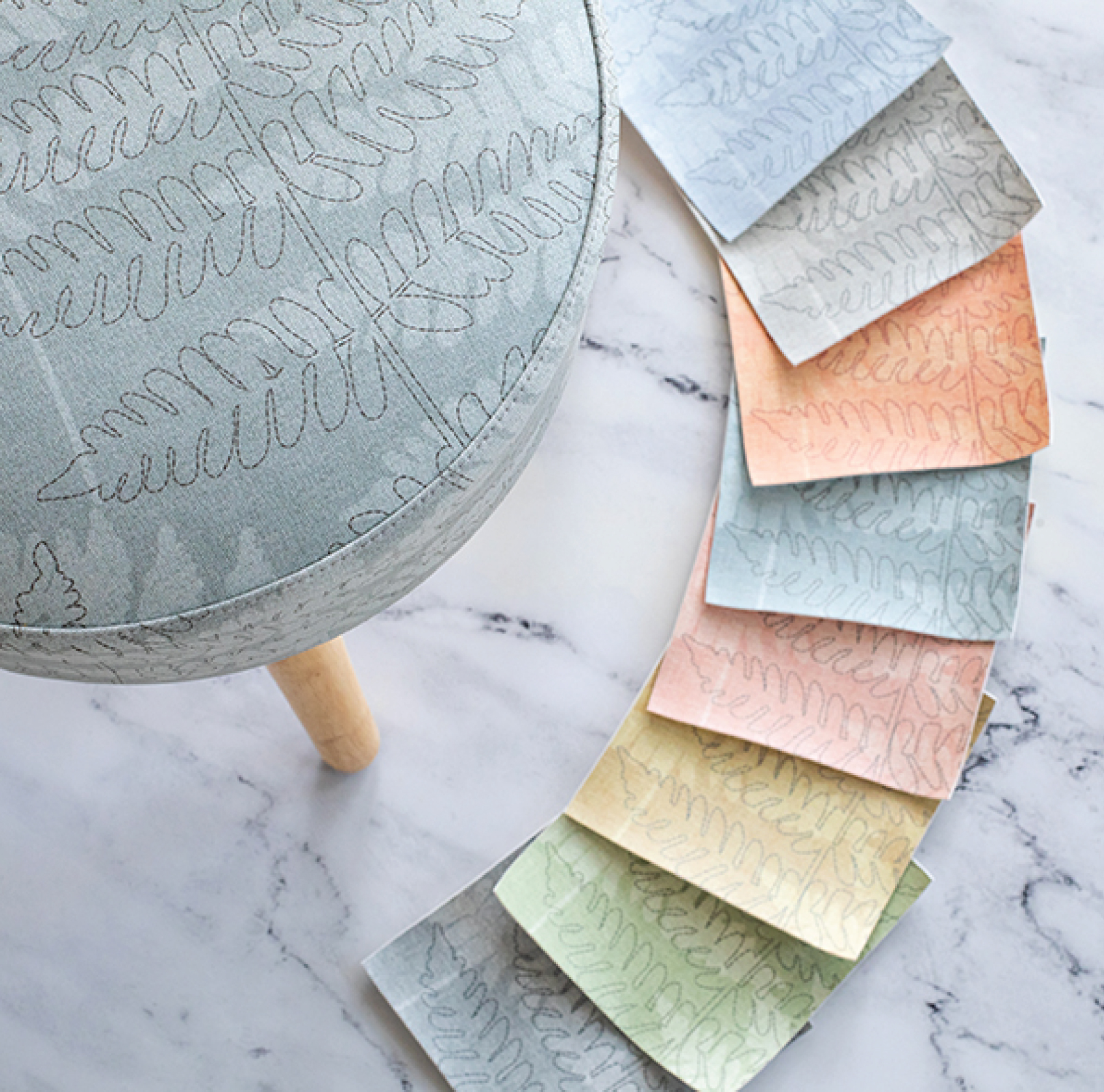
You can search the Design Pool library for a pattern that fits your space, or even request a custom pattern to match an existing element. You can view it in five available colorways or ask for custom colorways using Pantone chips. Designs can be printed on fabric, wall or floor covering, faux leather, glass panels, and more. They can also be printed onto pillows, duvets, framed artwork, even clocks through Domanda Design.
So, the next time you have a project that is looking for a wow factor to tie it all in together, you will see that combining neutrals in a color scheme can be anything but boring!
Share this post
Author
DESIGN/COLOR TRENDS AND AWESOME INFORMATION IN YOUR INBOX
Sign up for our monthly trend letter