Design Tip: Creating a Custom Color Palette
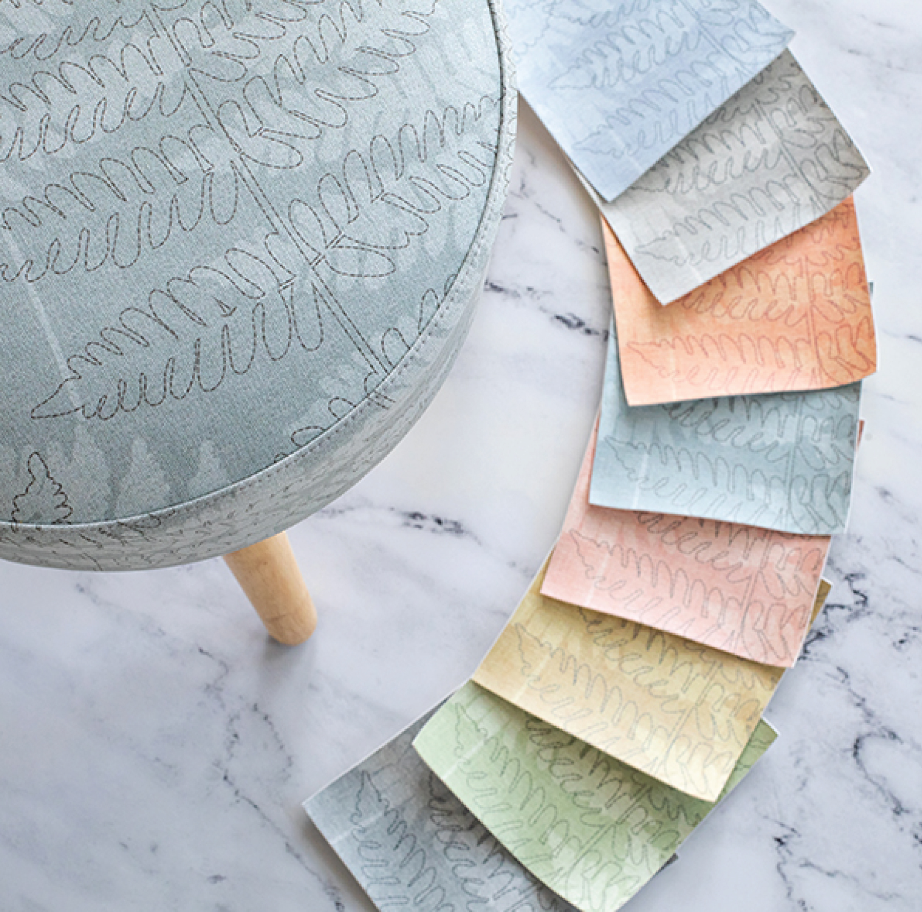
I’ve spent my whole career immersed in the world of home furnishings, commercial interiors, and fabric design. As a result, I am often being asked for advice when people are making design decisions in their interior spaces. (Trust me, you don’t want to invite me over to look at paint chips unless you really want my opinion!) Most of the time, people know what they want, but need validation. Other times, they aren’t quite sure how to take their idea and turn it into something they’d want to post on Pinterest. In a lot of cases, people just don’t trust their own color sense and want guidance on putting colors together in their space. I don’t know the secret to trusting your own color sense, but I often recommend that people create their own custom color palette first and work from that. With a palette in hand, you can pick out paint, fabric, and accessories and trust that they’ll look good together.
Creating a custom color palette may sound daunting, but you do not need a design degree to do it, I promise!
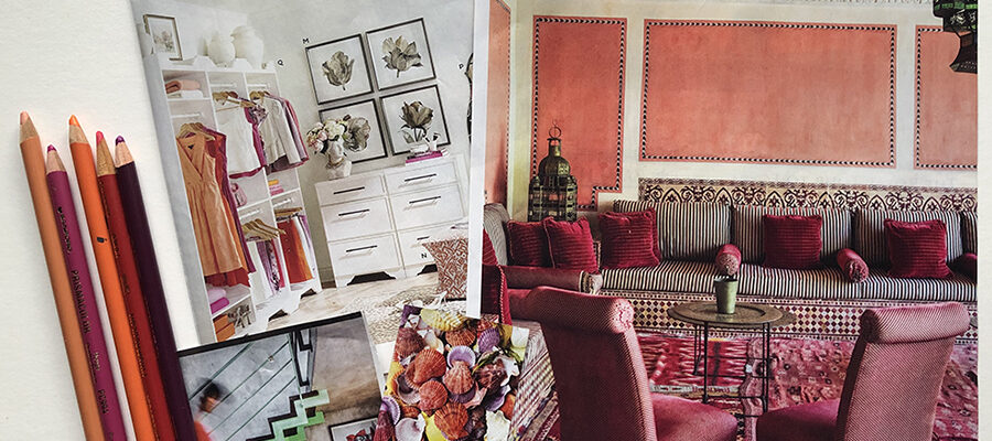
First, open your eyes and start looking around at how colors are working together in your own world, and which ones speak to you. Pull out an art book and look at your favorite paintings. What colors did the artist, stylist, or photographer put together? Go for a walk and stop and look at the colors mixing together on a flower, a bird, or a rocky beach and snap some photos and print them out so you can look closely at them. Flip through magazines and rip out pages that have colors that make you feel happy and good. These images are a valuable source of information to use to create a custom color palette that works beautifully.
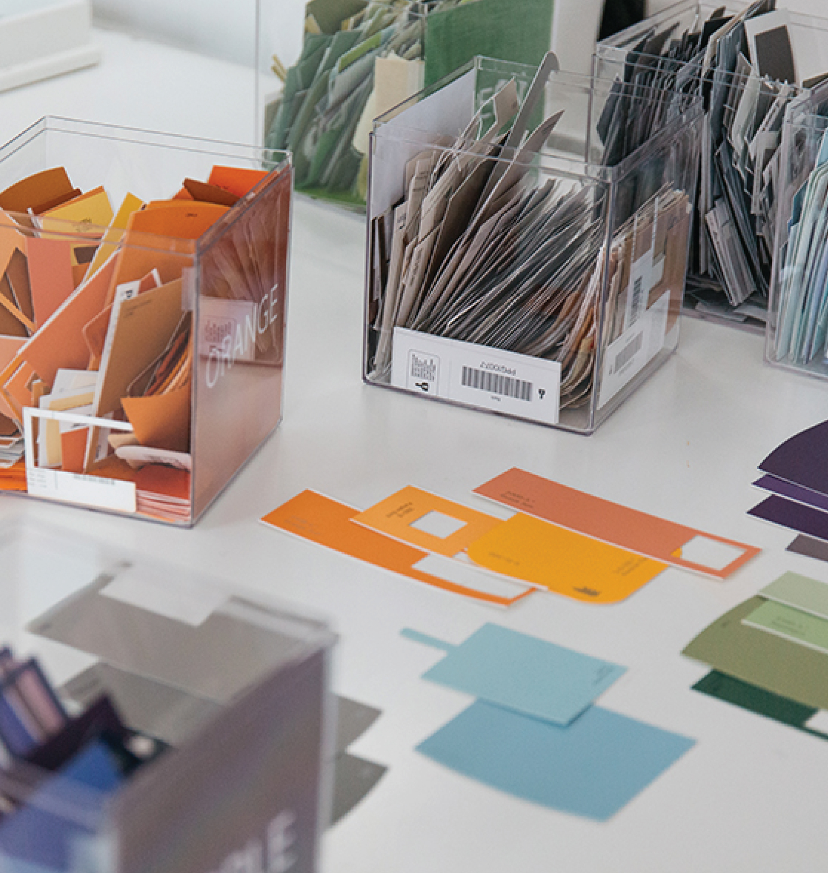
Next, choose one image or color story for an inspiration source to work from. Look at it and pick out a few individual colors from it. You can do this on your computer using the color picker feature, or old school with a paint set, colored pencils or crayons. It doesn’t matter, just use whatever you’re comfortable with and is readily available.
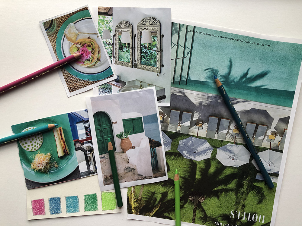
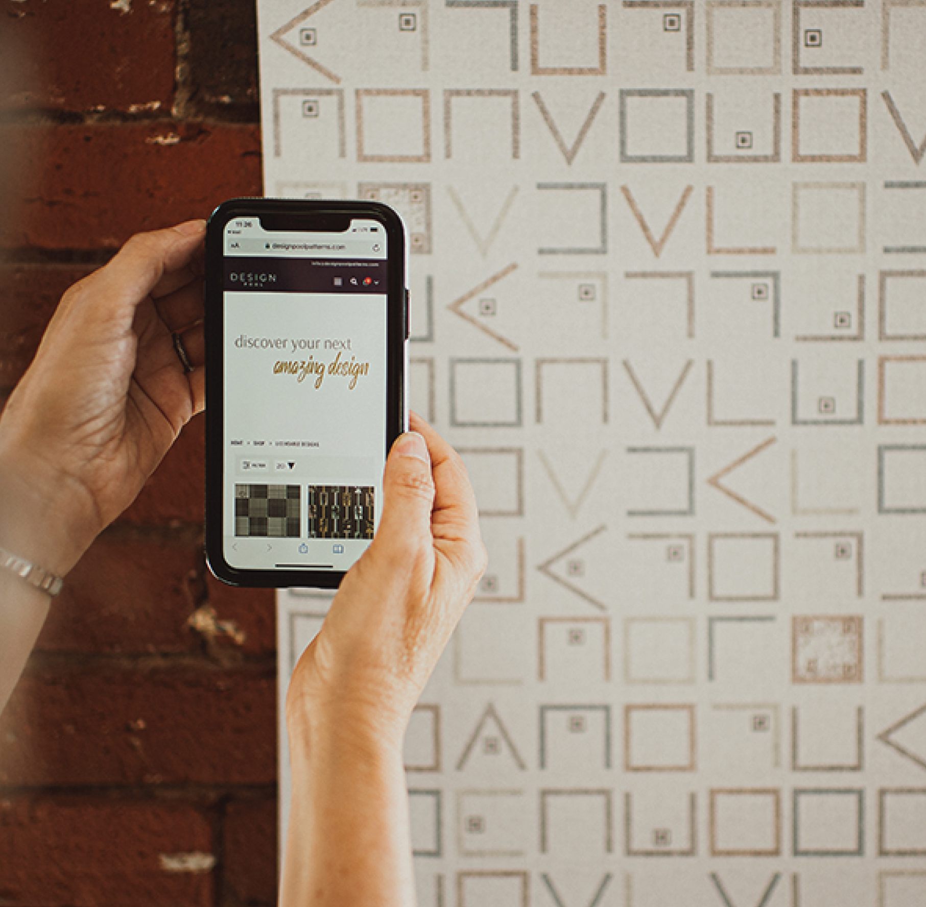
If art supplies are daunting, try an app that helps you pull colors from a scene. Adobe Capture and Pantone Studio both have the ability to create color swatches on the go with your phone. I love these apps for times when I may be traveling or just out for a walk. For best results, try to work off one main color that you love, and then pick out about 5 colors from your image to compliment that color. Keep in mind they don’t have to all be different colors. 2 or 3 can be tones of one color or neutrals.
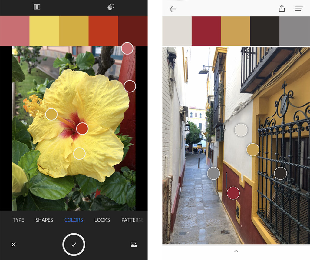
Once you have a palette you like, pin it on your corkboard or put it on the fridge. Use it as your reference as you work on a project. Remember, you don’t have to match these perfectly, but think of them as a starting point and aim for close enough. If you’re feeling stuck or indecisive, refer back to your palette to help you make decisions.
Was this design tip helpful? Let me know if you try it out and post your custom color palette on Instagram. Don’t forget to tag us so we can see it.
Share this post
Author
DESIGN/COLOR TRENDS AND AWESOME INFORMATION IN YOUR INBOX
Sign up for our monthly trend letter

