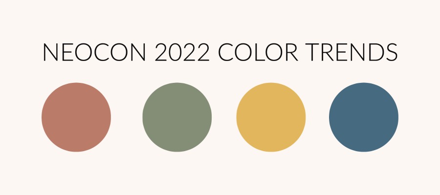
2022 NeoCon Color Trends
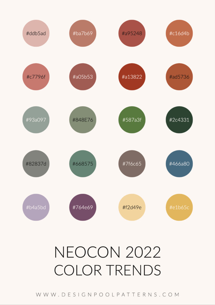
Walking the floors of theMART at NeoCon, we are keeping our eyes peeled for overarching trends in the industry. This year we saw four major trends: Acoustics, Biophilia, Transparency in Manufacturing, and the Experiential Office. In addition, we also pay attention to what colors are trending. For NeoCon color trends this year, we saw a lot of rich, earthy neutrals. Also, a lot of super saturated pastels and earth tones. In many showrooms, we saw entire spaces created with shades of a single color. For contrast, a pop of another color would be used sparingly. Often, that color was a bright, pure color such as a rich green, electric blue, or vibrant gold. Other times that pop of color was a biophilic element such as a beautiful plant or a moss wall. Overall, the colors felt grounding with moments of hopefulness and optimism.
In the healthcare spaces, the color palettes appeared to be taking their cue from spas and wellness centers. There was a lot of lavender, pale blue, and silver instead of sterile greys. Healthcare definitely seems to be trying to make their spaces more comfortable to set people at ease.
It’s always interesting to see what other people are saying about NeoCon. We all look at products through our own lens and experience and inevitably there are things we miss. I’m looking for trends always with an eye toward Design Pool, but what do other people see? I asked three different designers what they saw trending at NeoCon this year. Here are their answers!
What are other people saying about NeoCon Color Trends?
“I’m seeing a lot of green and the colors of Necco wafers. I’m seeing a lot of blonde woods, although walnut still exists. I’m seeing a lot of color-dipped products. For example, the frame of the chair is the same color as the upholstery of the chair, or the desk has legs of the same color as the top. Which I think is really quite attractive. This year everything is about acoustics. I think a lot of people are thinking about going back to the office and finding that it’s noisy there. I’m also seeing a lot of biophilia, things inspired by nature, including a lot of plants and moss walls.”
Paul Lewandowski
Principal, Paul Designs Projects
“The uplifted and optimistic energy found throughout NeoCon was certainly reflected in the color palettes on display in the showrooms. Saturated and softer mid-tones were accented with unexpected bright accents. Curvier edges on furniture shapes contrasted chonky, handwoven inspired textures, creating a fresh look. Blue-cast greens paired with camel (with a neon accent!), electric cobalt with clay tones, and blends of warmer and cooler red-oranges were all standouts in a sea of neutrals.”
Rebecca Lee
Creative Director, Contract, Crypton
“Once again, bulky textures dominated the textile scene while patterns were seemingly non-existent. Brands took more risks with color, straying away from typical rainbow brights. I especially appreciated the moody (dare I say retro) palette that emerged across multiple showrooms. Mid-tone golds, browns, and rusts felt fresh again.”
Jenni Chilver
Director of Design, Burch Fabrics
What about you? What did you see? Let us know! Tag us in any social posts you made about what you saw, or leave your thoughts in the comments.
Share this post
Author
DESIGN/COLOR TRENDS AND AWESOME INFORMATION IN YOUR INBOX
Sign up for our monthly trend letter